


Designing software for global deployment introduces a unique set of challenges, primarily centered around time. In distributed systems, latency, clock drift, and network delays can cause critical failures if not properly modeled. A UML Timing Diagram offers a specialized view for visualizing how objects change state over time. Unlike other diagrams that focus on flow, this notation prioritizes temporal constraints. It allows architects to define exactly when an event must happen relative to a system clock or another event.
This guide explores the mechanics of these diagrams, their application in complex environments, and the rules required to create them accurately. We will cover the fundamental building blocks, common patterns, and the strategic value of timing analysis in modern engineering.
Core Concepts and Definitions 🏗️
To understand the utility of this modeling technique, one must distinguish it from standard interaction diagrams. The primary focus here is duration rather than sequence.
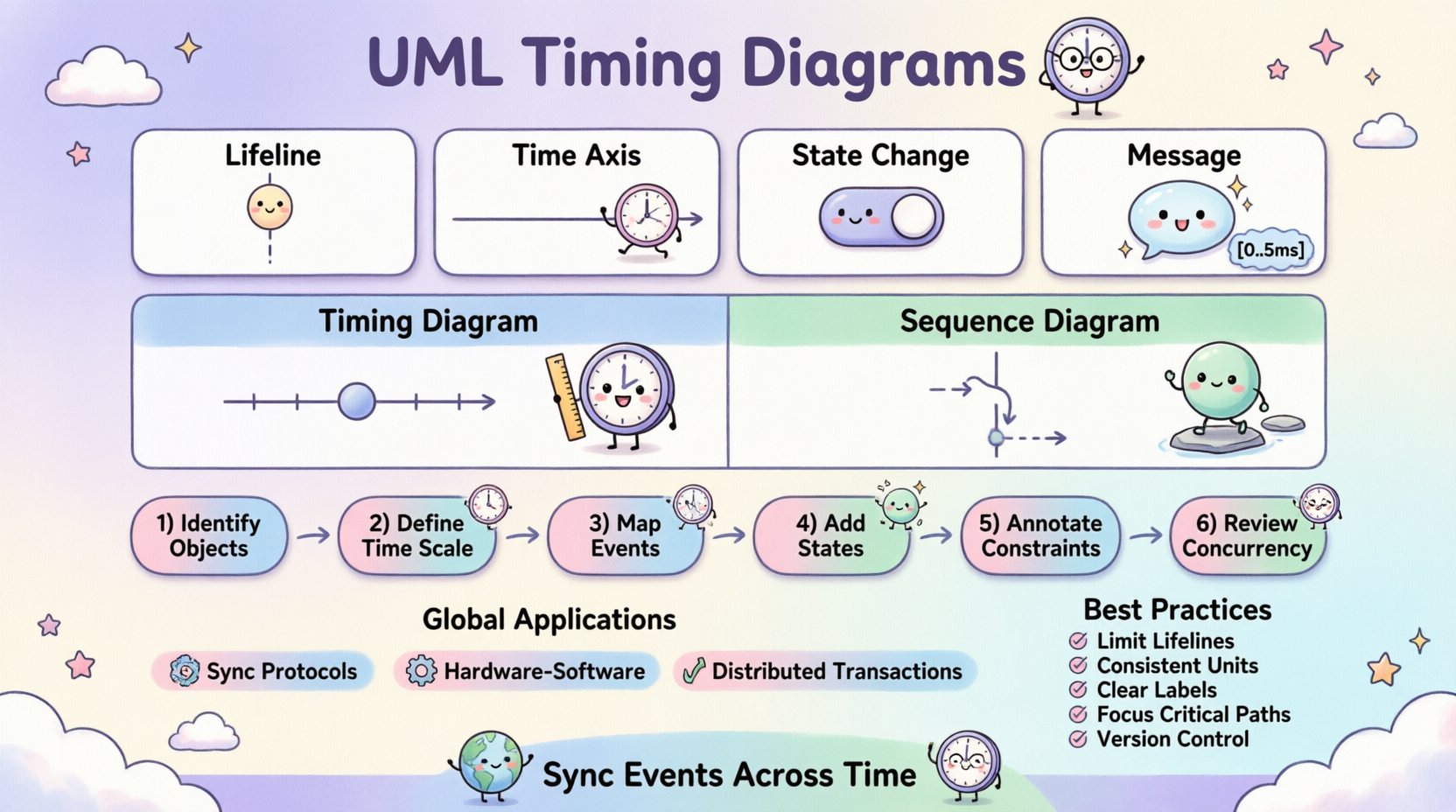
- Lifelines: Represent objects or system components. In timing diagrams, these are vertical lines that extend from the top to the bottom of the canvas.
- Time Axis: A horizontal axis running across the top. It indicates the flow of time, moving from left to right. This is the defining feature that separates this diagram from sequence diagrams.
- State/Condition Changes: These are the primary data points. They show the value of a variable or the state of an object at specific points in time.
- Messages: While present, they are annotated with time constraints. They indicate when a signal is sent and when it is expected to be received.
The combination of these elements creates a timeline view. This is particularly useful when the timing of a response is more critical than the order of operations. For instance, in a hardware control system, a sensor must read a value within 5 milliseconds of a trigger.
Key Elements and Notation 📏
Accuracy in modeling relies on adhering to the standard notation. Deviations can lead to misinterpretation during implementation. Below are the specific symbols used to convey timing information.
1. Activation Bars
Activation bars, also known as execution specifications, appear on lifelines. They indicate the period during which an object is performing an action. In timing diagrams, the length of this bar corresponds directly to the duration of the process.
- Entry: Marks the start of the action.
- Exit: Marks the completion of the action.
- Duration: The distance between entry and exit represents the time taken.
2. Time Constraints
Constraints are written in brackets, often using a specific syntax. They define limits on messages or state changes.
- [0..5ms]: Indicates the event must occur between 0 and 5 milliseconds.
- [>= 10ms]: Indicates the event must happen after at least 10 milliseconds.
- [!]: Marks a critical event that requires immediate attention.
3. State and Condition Expressions
These are small rectangles or markers placed on the lifeline. They represent the value of a variable or the status of a system component.
- State: Shows the current mode of the object (e.g., Active, Idle, Processing).
- Condition: Shows a boolean value (e.g., true, false, is_connected).
When a state changes, a vertical line connects the old state to the new state at the specific point in time. This visual cue makes it easy to spot delays or unexpected transitions.
Timing Diagram vs. Sequence Diagram ⚖️
Selecting the right diagram for the documentation task is crucial. While both deal with interactions, their purposes differ. The following table outlines the distinctions.
| Feature | UML Timing Diagram | UML Sequence Diagram |
|---|---|---|
| Primary Focus | Time duration and synchronization | Order of messages and logic flow |
| Time Axis | Horizontal, explicit scale | Vertical, relative order only |
| Best Used For | Real-time systems, latency analysis | Business logic, interaction flow |
| Detail Level | High precision on timestamps | High precision on message types |
| Complexity | Can become dense with time data | Can become dense with participants |
Understanding these differences prevents confusion. If the team needs to know what happens, use a sequence diagram. If they need to know when it happens, use a timing diagram.
Building a Timing Diagram: Step-by-Step Process 🛠️
Creating a valid model requires a structured approach. Rushing into drawing symbols without a plan often leads to errors. Follow these steps to construct a reliable diagram.
Step 1: Identify the Objects
List all components involved in the scenario. This includes users, external APIs, databases, and internal modules. Each object gets its own lifeline.
Step 2: Define the Time Scale
Choose a unit of measurement that fits the system. For web applications, seconds or milliseconds might work. For hardware interrupts, microseconds are necessary. Mark the scale on the horizontal axis.
Step 3: Map Critical Events
Identify the start and end points of the interaction. Mark the initial trigger event. This anchors the timeline.
Step 4: Add State Changes
Draw the vertical lines indicating state changes. Ensure they align with the time scale. If a state persists for a long time, use a horizontal line to show the duration.
Step 5: Annotate Constraints
Add brackets to messages to define acceptable time windows. This is where you specify the requirements. For example, a timeout value or a response deadline.
Step 6: Review for Concurrency
Check if multiple lifelines are active simultaneously. Ensure that parallel processes are represented correctly. Overlapping activation bars indicate concurrent execution.
Application in Global Systems 🌍
Global systems present unique timing challenges. Network latency varies by geography. Clock synchronization protocols like NTP (Network Time Protocol) are essential. Timing diagrams help model these scenarios.
1. Synchronization Protocols
When multiple servers need to agree on a state, they exchange messages. A timing diagram can show the window of time during which consensus must be reached. If the window is too narrow, the system may fail under load.
2. Hardware-Software Co-Design
In embedded systems, software must react to hardware interrupts. The diagram maps the interrupt signal, the context switch time, and the response time. This ensures the software meets real-time deadlines.
3. Distributed Transactions
Transactions spanning multiple databases require coordination. Timing diagrams visualize the commit and rollback phases. They help identify bottlenecks where one node is slower than the others.
Common Patterns and Scenarios 🔄
Certain patterns recur frequently in complex modeling. Recognizing them speeds up the design process.
1. The Timeout Pattern
This pattern handles cases where a response is not received in time. It involves a message sent, a timer set, and an alternative path if the timer expires.
- Message: Request sent.
- Constraint: Time limit set.
- Outcome: Error handling triggered if limit reached.
2. The Deadlock Prevention Pattern
Timing diagrams can reveal potential deadlocks by showing two objects waiting for each other indefinitely. If the activation bars overlap without resolution, a deadlock exists.
3. The Burst Traffic Pattern
In high-load scenarios, many requests arrive at once. The diagram shows the accumulation of messages on the lifeline and the time it takes to process the queue.
Best Practices for Clarity and Maintenance 📝
As diagrams grow, they can become unreadable. Adhering to guidelines ensures the documentation remains useful over time.
- Limit Lifelines: Avoid putting too many objects on one diagram. Split complex scenarios into smaller sub-diagrams.
- Use Consistent Units: Do not mix milliseconds and seconds in the same view. Convert everything to a base unit.
- Label Clearly: Every state change and message should have a clear label. Avoid abbreviations that are not standard.
- Focus on Critical Paths: Do not model every possible path. Focus on the critical timing constraints that affect system stability.
- Version Control: Treat diagrams as code. Update them when requirements change.
Challenges in Modeling Time ⚠️
Even with a clear methodology, challenges remain. Engineers must be aware of potential pitfalls.
1. Precision vs. Abstraction
Too much detail makes the diagram hard to read. Too little detail makes it useless. Finding the balance depends on the audience. Stakeholders may need high-level views, while developers need precise timestamps.
2. Clock Drift
In distributed systems, clocks are never perfectly synchronized. Models should account for a margin of error. Explicitly state the expected drift in the documentation.
3. Non-Determinism
Sometimes, time is not deterministic. Network jitter can cause variations. Models should show best-case, worst-case, and average-case scenarios if possible.
4. Scalability
A diagram for a single transaction is easy. A diagram for a system with millions of concurrent users is impossible to draw. Use timing diagrams for critical subsystems, not the entire architecture.
Integration with Other UML Models 🧩
Timing diagrams do not exist in isolation. They complement other models to provide a complete picture of the system.
- State Machine Diagrams: Timing diagrams often trigger state changes. Use them together to show how time affects state transitions.
- Activity Diagrams: Activity diagrams show the flow of control. Timing diagrams add the temporal dimension to this flow.
- Component Diagrams: Component diagrams show the structure. Timing diagrams show the behavior of those structures over time.
Using these models in conjunction creates a robust design document. It ensures that structure, behavior, and time are all aligned.
Practical Example: Payment Processing 🏦
Consider a payment gateway processing a transaction. This scenario involves multiple external systems.
- Initiation: User clicks “Pay”. Time: 0ms.
- Validation: System checks card details. Duration: 50ms.
- Request: System sends request to bank. Time: 100ms.
- Response: Bank approves transaction. Time: 200ms.
- Confirmation: System updates database. Duration: 30ms.
A timing diagram for this would show the lifelines for the User Interface, the Payment Gateway, and the Bank API. Activation bars would show the processing time. Messages would show the network requests. Time constraints would ensure the total time does not exceed 500ms.
Conclusion and Final Thoughts 🧭
Modeling time is as important as modeling logic. In global systems, the difference between a successful deployment and a failure often comes down to milliseconds. UML Timing Diagrams provide the necessary tools to visualize, analyze, and document these temporal relationships.
By following the standard notation and focusing on critical paths, teams can reduce ambiguity. They can identify bottlenecks before writing code. They can ensure that the system meets its performance requirements. While the diagrams require discipline to create, the value they provide in system reliability is significant.
Continuous refinement is key. As the system evolves, the diagrams must evolve with it. Regular reviews ensure that the documentation remains an accurate reflection of the architecture. This discipline leads to more stable, predictable, and efficient software systems.