


Presenting technical artifacts to business teams is a critical skill for any systems analyst or data architect. One of the most common challenges involves the Data Flow Diagram (DFD). While DFDs are powerful tools for mapping system logic, they often appear as complex charts filled with jargon to those outside the engineering department. To bridge this gap, you must translate technical precision into business value. This guide outlines a structured approach to presenting DFDs, ensuring clarity, alignment, and actionable feedback from non-technical audiences.
🧐 Understanding the Data Flow Diagram
Before presenting, you must understand exactly what a Data Flow Diagram represents. It is not a flowchart. It does not show the sequence of events or decision logic in the way a flowchart does. Instead, a DFD maps the movement of data through a system. It focuses on where data comes from, what happens to it, and where it goes.
When you stand before a stakeholder, they are not interested in the internal mechanics of the database or the API endpoints. They are interested in the business processes. Therefore, your presentation must align the diagram with their operational reality.
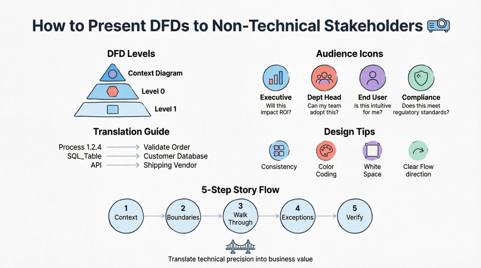
- Context Diagram: This is the highest-level view. It shows the system as a single process and its interactions with external entities (people, systems, organizations).
- Level 0 Diagram: This breaks the main process into major sub-processes. It provides a high-level overview of the internal structure.
- Level 1 Diagram: This decomposes Level 0 processes into detailed steps. This level is often too technical for general stakeholders but useful for specific functional leads.
Choosing the right level of detail is the first decision you make. For general stakeholders, the Context Diagram and Level 0 are usually sufficient. Level 1 should be reserved for deep-dive sessions with functional owners.
👥 Analyzing Your Audience
Not all non-technical stakeholders are the same. A Chief Financial Officer (CFO) has different concerns than a Marketing Manager or an Operations Lead. Understanding their specific needs allows you to tailor the narrative.
| Stakeholder Role | Primary Interest | Key Question to Answer |
|---|---|---|
| Executive Leadership | Strategic alignment, ROI, timeline | How does this process improve our bottom line? |
| Department Heads | Workflow efficiency, resource allocation | How does this change my team’s daily tasks? |
| End Users | Usability, data entry, output quality | Will this make my job easier or harder? |
| Compliance/Legal | Data security, audit trails, regulations | Where does sensitive data sit and who sees it? |
By mapping the diagram elements to these interests, you can highlight the right data flows. For example, when speaking to Compliance, highlight the data stores and the external entities that access them. When speaking to Operations, highlight the processes that involve manual intervention.
🗣️ Translating Technical Jargon
One of the biggest barriers to understanding is vocabulary. Terms like “entity relationship,” “normalization,” “API call,” or “batch processing” create cognitive friction. You must replace these with business terminology.
- Process Symbols: Instead of “Process 1.2.4,” use “Validate Customer Order.” The label should describe the business activity, not the system function.
- Data Stores: Instead of “SQL_Table_Users,” use “Customer Database” or “Order History.” If they do not know what a database is, call it a “Storage Location” or “Record Book.”
- External Entities: Instead of “3rd Party API,” use “Shipping Vendor” or “Payment Gateway.”
- Data Flows: Instead of “JSON Payload,” use “Order Information” or “Payment Confirmation.”
This translation does not mean you are dumbing down the content. It means you are making the content accessible. If a stakeholder understands the business meaning of the data flow, they can validate whether the logic is correct, regardless of the underlying technology.
🎨 Visual Design Principles for Clarity
A cluttered diagram confuses even the most technical audience. When presenting to non-technical groups, visual clarity is paramount. The goal is to reduce cognitive load so the stakeholder can focus on the logic, not the graphics.
- Consistency is Key: Use the same shape for all processes. Use the same shape for all data stores. Do not mix notations (e.g., Gane-Sarson vs. Yourdon/DeMarco) within the same document.
- Color Coding: Use color strategically, not decoratively. Use one color for inputs, another for outputs, and a neutral color for processes. Highlight critical paths in red to draw attention to compliance or security checkpoints.
- White Space: Do not cram the diagram. Allow breathing room between elements. If a diagram requires scrolling, it is too complex for a single slide. Break it into multiple views.
- Directionality: Ensure arrows point clearly. Left-to-right or top-to-bottom flows are intuitive. Avoid crossing lines where possible, as they create visual noise.
When you create the visual asset, imagine you are designing a map. A good map guides the traveler. A bad map overwhelms them with too many streets and no landmarks.
📖 Structuring the Presentation Narrative
Do not simply project the diagram and ask for feedback. You need to guide the audience through the diagram. A structured narrative ensures you cover all necessary points without losing their attention.
- Set the Context: Start with the business problem. Why are we building this? What value does it create? Connect the diagram to the “why.”
- Identify the Boundaries: Show the Context Diagram first. Define what is inside the system and what is outside. This prevents scope creep discussions later.
- Walk Through the Flow: Trace a specific example. Say, “Let’s follow a customer placing an order.” Start at the external entity, move through the processes, and end at the data store. This makes the abstract concrete.
- Highlight Exceptions: Non-technical stakeholders often think in terms of “what if.” Show them where the process handles errors or exceptions. This builds confidence in the system’s robustness.
- Invite Verification: Explicitly ask, “Does this match how you currently handle this?” This turns the presentation into a validation session rather than a lecture.
💬 Handling Feedback and Objections
During the presentation, stakeholders may point out flaws in the logic. Some might suggest changes that seem technically impossible. Others might identify missing requirements. How you handle these moments defines the success of the meeting.
- Listen Without Interrupting: Let them finish their thought. They are often thinking about the business impact, not the technical implementation.
- Validate the Intent: If they suggest a change, ask what business problem they are trying to solve. Often, they want the same outcome you do, just via a different path.
- Separate Logic from Implementation: If a stakeholder asks about a specific database table, explain that the diagram shows the data, not the storage. Reiterate that the storage mechanism is an implementation detail.
- Defer Technical Constraints: If a requirement conflicts with system capabilities, do not say “No.” Say, “That requires a specific capability we need to evaluate. Let’s note that as a risk.”
It is crucial to keep the conversation focused on the data and the process, not the technology. If the conversation drifts into code or server specs, gently steer it back to the business outcome.
🚫 Common Mistakes to Avoid
Avoiding pitfalls is just as important as executing best practices. Many analysts make the same errors when bridging the gap between technical and business worlds.
- Over-Engineering: Creating a Level 1 diagram for a high-level strategy meeting is a mistake. It overwhelms the audience with unnecessary detail.
- Ignoring Control Flows: Sometimes stakeholders care about approvals or permissions. While standard DFDs focus on data, you may need to annotate where control logic exists (e.g., “Approved by Manager”).
- Assuming Shared Knowledge: Do not assume they know what “Data Store” means. Always define your symbols in a legend or verbally during the presentation.
- Focusing on the Future: Do not present the “To-Be” state without acknowledging the “As-Is” state. Stakeholders need to see how the current pain points are resolved in the new model.
- Skipping the Validation: Never assume they understood. Ask them to summarize the flow back to you. This confirms alignment.
📋 Preparation Checklist
Before you walk into the room, ensure you have completed the following steps to guarantee a smooth presentation.
- ☑️ Review Stakeholder Roles: Confirm who will attend and what their specific responsibilities are.
- ☑️ Translate Labels: Ensure all process and data flow names are business-friendly.
- ☑️ Prepare Legends: Create a simple key for any symbols used.
- ☑️ Define Scope: Write down what is explicitly excluded from the diagram to prevent scope creep.
- ☑️ Test on a Peer: Show the diagram to a colleague who is not an expert to gauge clarity.
- ☑️ Backup Plan: Have a simplified version ready in case the main diagram is too complex to display on the screen.
🔄 Post-Presentation Follow-Up
The meeting does not end when the presentation concludes. The work begins after. Capturing the feedback accurately is essential for refining the system design.
- Distribute Minutes: Send a summary of the discussion immediately. Include the decisions made and the open questions.
- Update the Diagram: Reflect the agreed-upon changes in the artifact. Version control is vital here.
- Re-Validate: If significant changes were made, send the updated diagram back to the stakeholders for confirmation. This closes the loop.
- Track Decisions: Maintain a log of why certain design choices were made. This helps if questions arise months later during implementation.
✅ Measuring Understanding
How do you know the presentation was successful? You cannot rely on nodding heads. You need concrete indicators of understanding.
- The Teaching Test: Ask a stakeholder to explain the process flow back to you. If they can articulate it in their own words, they understand.
- Requirement Accuracy: If the requirements gathered after the meeting align with the diagram, the communication was effective.
- Reduced Rework: If the development team does not have to return to stakeholders for clarification on process logic, the DFD served its purpose.
- Stakeholder Confidence: If stakeholders feel comfortable signing off on the design, they trust the model.
🌟 Final Thoughts on Communication
Presenting Data Flow Diagrams is not just about drawing boxes and arrows. It is about facilitating a shared understanding of how information moves through an organization. It requires patience, clarity, and a deep respect for the business context.
When you succeed, you transform the DFD from a technical diagram into a business asset. It becomes a source of truth that aligns developers, managers, and users. This alignment reduces errors, saves time, and ensures the final system actually solves the business problem it was built to address.
Focus on the data, simplify the language, and respect the audience’s time. With these principles, your presentations will be clear, effective, and valuable to everyone involved.