

In modern software engineering, the complexity of infrastructure scales alongside the number of developers and services. A monolithic architecture might be represented by a single block, but a microservices environment requires a clear map of nodes, artifacts, and connections. This is where the UML Deployment Diagram becomes essential. It provides a static view of the physical architecture, showing where software components are deployed and how they interact over the network.
For large teams, maintaining this visualization is not just about drawing boxes; it is about establishing a shared language between developers, operations engineers, and stakeholders. Without a standardized approach, diagrams become outdated artifacts that hinder rather than help. This guide outlines the structural, procedural, and semantic standards required to create deployment diagrams that remain accurate, scalable, and useful throughout the lifecycle of a system.
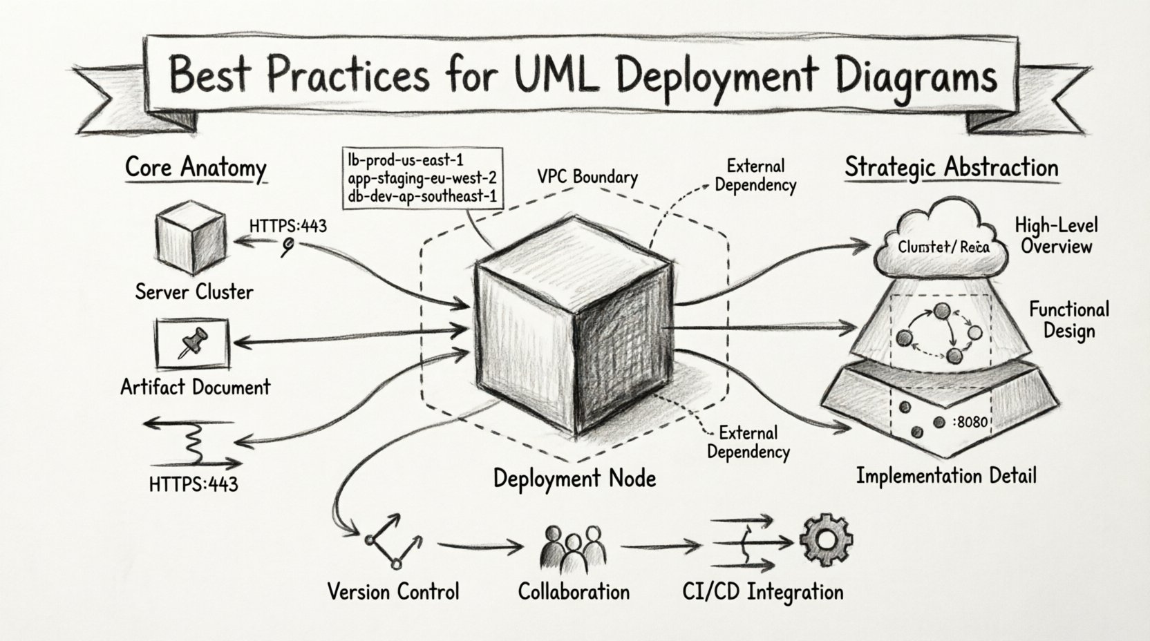
🧩 Understanding the Core Anatomy of Deployment Diagrams
Before applying best practices, it is crucial to understand the specific elements that constitute a deployment diagram. Unlike class diagrams which focus on logic, or sequence diagrams which focus on interaction over time, deployment diagrams focus on the physical realization of the system.
- Deployment Nodes: These represent the physical hardware or virtual environments where software resides. Examples include servers, routers, embedded devices, or cloud instances. They are depicted as 3D cubes.
- Artifacts: These are the physical files or components deployed onto the nodes. This includes executable binaries, libraries, configuration files, and database schemas.
- Communication Paths: These lines connect nodes or artifacts, indicating the network protocol used for communication, such as HTTP, TCP/IP, or JMS.
- Interfaces: While less common in pure deployment views, interfaces can define how a node exposes functionality to another node.
When working with large teams, clarity in these definitions prevents ambiguity. A “Server” in one team’s diagram might represent a logical load balancer in another’s. Standardizing the visual representation of these nodes ensures that everyone interprets the infrastructure map identically.
📊 Strategic Abstraction Levels for Scalability
One of the most common pitfalls in large-scale projects is attempting to depict every single server in a single diagram. This leads to cluttered visuals that obscure the actual architecture. Effective visualization relies on strategic abstraction.
1. The Cluster Concept
Instead of drawing fifty individual web servers, use a Deployment Node to represent a cluster. You can then specify the quantity within the node label (e.g., “Web Servers: 5x”). This reduces visual noise while retaining critical information about capacity.
2. Layered Diagrams
Split the architecture into logical layers. A Frontend Diagram might show load balancers and CDN nodes. A Backend Diagram focuses on application servers and databases. A Data Diagram details storage clusters and backup systems. Linking these diagrams via cross-references maintains detail without overwhelming the viewer.
3. Environment Separation
Do not mix Development, Staging, and Production environments in one view. Each environment has distinct security requirements and configurations. Creating separate diagram sets for each environment prevents accidental misconfiguration during deployment planning.
| Abstraction Level | Use Case | Detail Granularity |
|---|---|---|
| High-Level Overview | Executive Summaries, Architecture Reviews | Low (Clusters, Regions) |
| Functional Design | DevOps Planning, Team Handoffs | Medium (Node Groups, Protocols) |
| Implementation Detail | Specific Server Configuration | High (Specific Instances, Ports) |
🏷️ Naming Conventions and Standardization
In a large organization, multiple teams may work on different parts of the infrastructure. Without strict naming conventions, the diagram becomes a puzzle where labels mean different things to different people.
- Consistent Prefixes: Use prefixes to denote function. For example, use
lb-for load balancers,app-for application servers, anddb-for database nodes. - Environment Tags: Append environment identifiers to node names.
prod-db-primaryis clearer than justdatabase. - Protocol Specifications: Label communication paths with the specific protocol. Instead of a generic line, label it
HTTPS:443orPostgreSQL:5432. - Artifact Naming: Ensure artifact names match the actual file structures. If a binary is deployed as
api-v2.jar, the diagram should reflect that exact name.
Adhering to these standards allows automated tools to parse the diagrams later if needed. It also aids in searching documentation. If a search query for “db” is run, it should return relevant database nodes across all diagrams.
🔗 Managing Dependencies and Connections
Infrastructure is defined by relationships. A diagram is useless if it shows nodes but not how they talk to each other. However, in large systems, the web of connections can become a tangled mess.
1. Minimize Cross-References
Avoid drawing lines that cross the entire diagram if possible. If a service in Cluster A talks to a service in Cluster B, group the related nodes closer together visually, even if they are logically separate. If lines must cross, use a dashed line or a distinct color to indicate external dependencies.
2. Directionality
Always use arrowheads to indicate the direction of the request. Does the Frontend call the API? Does the API call the Database? The arrow points to the consumer or the provider depending on the convention, but it must be consistent. A common convention is that the arrow points to the service providing the functionality.
3. Protocol Visibility
Security and performance depend on the protocol. Explicitly labeling ports and protocols on the communication paths helps security teams audit the diagram for open ports. For example, labeling a path as SSH:22 immediately flags a potential security risk if that path exists between public-facing nodes.
📂 Version Control for Architecture
Software code is version controlled. Infrastructure diagrams should be treated with the same rigor. Treating diagrams as static documents leads to the “diagram rot” problem, where the visual documentation no longer matches the running system.
- Store as Text: Whenever possible, store the diagram definition in a text format (such as a modeling language or structured text) rather than a binary image file. This allows for diffing and version tracking.
- Commit Triggers: Integrate diagram updates into the deployment pipeline. When a server role changes in the infrastructure code, a pull request should include an update to the corresponding diagram.
- Tagging: Tag diagram versions with specific release numbers or deployment epochs. This allows teams to look back at what the infrastructure looked like during a specific incident or release.
👥 Collaboration Workflows for Large Teams
Who owns the diagram? In large teams, ownership is often unclear. This leads to stale documentation. Establishing a clear workflow is as important as the diagram itself.
1. The Single Source of Truth
Designate one diagram set as the official source of truth. If teams maintain local copies for their own use, ensure there is a process to sync them with the master version. Do not allow multiple conflicting versions to exist in the shared documentation repository.
2. Review Cycles
Implement a mandatory review step for architectural changes. When a new service is introduced, the diagram must be updated before the service is merged into the main branch. This ensures the visualization keeps pace with the codebase.
3. Role-Based Access
Not everyone needs to edit the diagram. Assign read-only access to stakeholders and read-write access to infrastructure architects and DevOps engineers. This prevents accidental changes that break the semantic integrity of the model.
⚠️ Common Pitfalls and Solutions
Even experienced teams fall into traps when visualizing complex infrastructure. The following table outlines common issues and their practical solutions.
| Pitfall | Impact | Solution |
|---|---|---|
| Overcrowding | Diagram becomes unreadable | Use sub-diagrams or zoom levels to hide detail |
| Missing Protocols | Security gaps in deployment | Enforce mandatory protocol labels on all links |
| Static Artifacts | Version mismatch between code and diagram | Link artifacts to version control tags |
| Unclear Ownership | Diagram becomes outdated | Assign specific owners to each node cluster |
| Environment Mixing | Accidental production changes | Strictly separate diagrams by environment |
🔄 Integration with DevOps and CI/CD
The modern deployment process is automated. The diagram should reflect this reality. Static diagrams that ignore the dynamic nature of cloud infrastructure are less useful.
- Auto-Scaling Representation: In cloud environments, nodes often scale up and down. Represent this using notation that indicates dynamic capacity, rather than fixed numbers.
- Container Awareness: If using container orchestration, show the relationship between the orchestration platform (like a cluster manager) and the container images. This clarifies where the actual workload resides.
- Network Topology: Include virtual private clouds (VPCs) or subnets as containers for the nodes. This visualizes the security boundaries which are critical for compliance.
When diagrams are integrated into the CI/CD pipeline, they can serve as validation steps. If a deployment script tries to spin up a node that does not exist in the approved diagram, the pipeline can flag the discrepancy. This ensures that the visual model remains a reliable guide for operational tasks.
🛠️ Maintenance and Lifecycle Management
A diagram is a living document. It requires maintenance just like the code it represents. Without a maintenance plan, the value of the diagram diminishes over time.
Quarterly Audits: Schedule a quarterly review where the diagram is compared against the live infrastructure. This is often best done by a dedicated architect or a senior DevOps engineer.
Change Management: Link diagram changes to the organization’s change management system. If a server is replaced, a ticket should exist that references the diagram update.
Training: Ensure new team members understand the diagram standards. Onboarding sessions should include a walkthrough of how to read the current deployment maps. This reduces the learning curve for understanding the system.
🎯 Final Thoughts on Infrastructure Visualization
Creating accurate UML Deployment Diagrams for large teams requires discipline, standardization, and a commitment to maintenance. It is not merely a drawing exercise; it is a communication tool that aligns technical execution with architectural intent.
By focusing on strategic abstraction, strict naming conventions, and integrated workflows, teams can ensure their infrastructure maps remain valid. This validity translates to faster onboarding, fewer deployment errors, and clearer communication during incident response. The effort invested in maintaining these diagrams pays dividends in system reliability and operational efficiency.
Remember that the goal is not to create a perfect picture, but a useful one. A diagram that is 90% accurate and up-to-date is far more valuable than one that is 100% accurate but outdated. Prioritize the flow of information and the clarity of the architecture above aesthetic perfection. When the diagram serves the team, the infrastructure succeeds.