

In the modern landscape of software development, the speed and reliability of delivery are paramount. Organizations strive to release features rapidly while maintaining high stability. However, as pipelines grow in complexity, visualizing the flow of code from commit to production becomes increasingly difficult. This is where Unified Modeling Language (UML) Activity Diagrams prove invaluable. By treating the continuous integration and continuous deployment (CI/CD) process as a modeled system, teams can identify bottlenecks, standardize workflows, and reduce cognitive load during incident response.
This guide explores how visual modeling enhances pipeline management. We will examine the practical application of UML activity diagrams within a DevOps context, focusing on structure, clarity, and process optimization. No specific software tools are required for this methodology; the focus remains on the logical flow and architectural design of the workflow itself.
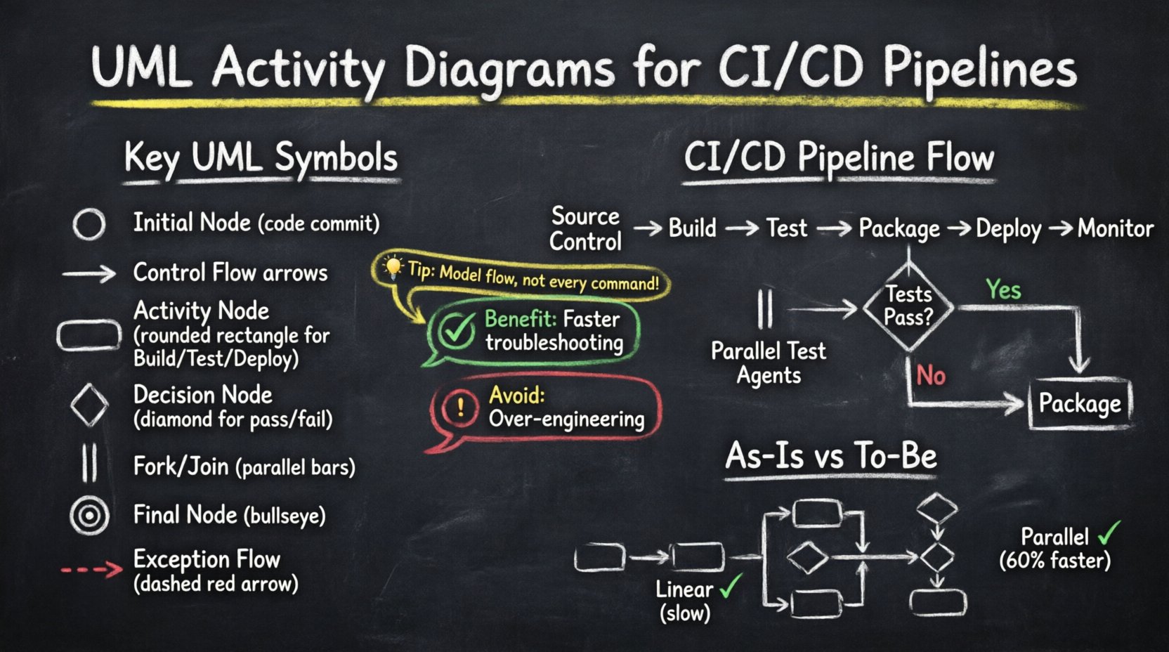
Understanding UML Activity Diagrams in a DevOps Context 🧠
An UML Activity Diagram is a behavioral diagram that depicts the flow of control from one activity to another. In the context of software delivery, it serves as a blueprint for the automated processes that move code through various stages. Unlike static architecture diagrams, activity diagrams capture the dynamic nature of execution, making them ideal for mapping sequential and parallel tasks.
Key Elements for Pipeline Modeling
To effectively model a CI/CD pipeline using UML, specific symbols represent distinct operational states and transitions. Understanding these elements ensures accurate documentation and communication among stakeholders.
- Initial Node: Represents the trigger event, typically a code commit or a scheduled build request.
- Control Flow: The arrow connecting activities, indicating the direction of the process.
- Activity Node: A rounded rectangle representing a specific task, such as compiling code or running tests.
- Decision Node: A diamond shape indicating a branching point based on a condition (e.g., test pass/fail).
- Fork/Join Node: Represents the splitting of a process into parallel threads or the synchronization of multiple paths.
- Activity Final Node: A bullseye symbol marking the successful completion of the workflow.
- Exception Flow: Dashed lines indicating error paths or rollback procedures.
The Anatomy of a CI/CD Pipeline 🏗️
Before modeling, one must understand the standard components of a typical delivery pipeline. While tools vary, the logical stages remain consistent across the industry. Mapping these stages to UML nodes helps in creating a standardized view of the system.
Core Stages of Delivery
- Source Control: The repository where code resides. This is the entry point for the workflow.
- Build: The compilation process where source code is transformed into executable artifacts.
- Test: A phase encompassing unit tests, integration tests, and security scanning.
- Package: The creation of deployable containers or archives.
- Deploy: The movement of artifacts to staging or production environments.
- Monitor: Post-deployment verification to ensure system health.
Each stage represents a potential point of failure or delay. By modeling these stages, teams can see exactly where the flow might stall.
Case Study Scenario: Enterprise Application Delivery 🏢
Consider a mid-sized enterprise developing a monolithic application transitioning toward microservices. The team struggled with inconsistent deployment times and frequent rollbacks. The root cause was a lack of visibility into the pipeline logic. Manual interventions were common, and dependencies between build and deploy steps were unclear.
Challenges Identified
- Long Lead Times: It took over 48 hours from commit to production.
- Bottlenecks: Integration tests ran sequentially, delaying feedback.
- Hidden Dependencies: Deployments failed due to missing configuration steps not documented in the workflow.
- Communication Gaps: Developers and Operations teams used different terminology for the same steps.
The solution involved creating a comprehensive set of UML activity diagrams to document and redesign the workflow. This was not a one-time exercise but an iterative process to align the technical implementation with the visual model.
Visualizing the “As-Is” State 📉
The first step in improvement is documenting the current reality. The team mapped the existing manual and automated steps into a UML activity diagram. This revealed significant inefficiencies that were previously invisible in the console logs.
Findings from the Initial Model
- Linear Execution: Tests were run one after another. A failure in the final test blocked the entire build, wasting time on earlier passed tests.
- Manual Gates: Certain stages required human approval without clear criteria for the decision node.
- Missing Error Handling: If a build failed, there was no defined path for recovery or notification.
- Parallel Inefficiency: Resources were underutilized because parallel processing was not modeled or configured.
By drawing the “As-Is” diagram, the team could point to specific nodes where time was being lost. This data-driven approach shifted the conversation from “we need faster tools” to “we need better flow logic”.
Designing the “To-Be” State 📈
With the problems identified, the team designed a new activity diagram. This model incorporated parallel execution, conditional logic, and automated rollback paths. The goal was to reduce lead time and increase reliability.
Optimization Strategies
- Parallel Test Execution: Using fork nodes to split test suites across multiple agents. This reduced the test phase duration by 60%.
- Automated Decision Nodes: Replacing manual approval gates with automated metrics thresholds (e.g., code coverage > 80%).
- Exception Flows: Defining clear paths for failure, such as triggering a notification and archiving the artifact without deployment.
- Conditional Branching: Different deployment paths for development, staging, and production environments.
The new diagram served as the single source of truth for the pipeline configuration. Every engineer could refer to the diagram to understand how a change would propagate through the system.
Mapping UML Elements to Pipeline Logic 🔄
To ensure the diagram remains useful, it is critical to map abstract UML symbols to concrete pipeline actions. The following table illustrates how specific diagram elements translate to operational logic.
| UML Element | Pipeline Equivalent | Function |
|---|---|---|
| Initial Node | Webhook / Cron Trigger | Starts the workflow |
| Activity Node | Build Job / Test Suite | Executes a specific task |
| Decision Node | Pass/Fail Gate | Branches based on result |
| Fork Node | Parallel Agents | Splits workflow into threads |
| Join Node | Wait for Completion | Re-synchronizes parallel threads |
| Activity Final Node | Success / Deploy | Ends workflow successfully |
| Exception Flow | Rollback / Alert | Handles failure states |
Implementation Strategy for Teams 🛠️
Creating diagrams is only half the battle. Integrating this modeling practice into the daily workflow requires a structured approach. Teams must ensure the diagrams evolve alongside the code.
Step-by-Step Integration
- Assign Ownership: Designate a specific role or team to maintain the pipeline documentation.
- Version Control Models: Store the diagram files alongside the pipeline configuration code. This ensures changes to the workflow are reviewed via pull requests.
- Regular Audits: Schedule quarterly reviews to ensure the visual model matches the actual runtime behavior.
- Onboarding Tool: Use the diagrams as the primary resource for training new developers on the deployment process.
- Incident Response: During outages, reference the diagram to trace the exact point of failure quickly.
Benefits of Visual Modeling in CI/CD ✅
Adopting UML activity diagrams for pipeline management yields measurable improvements in engineering efficiency. The benefits extend beyond simple documentation.
- Reduced Cognitive Load: Engineers do not need to memorize the flow; they can look at the diagram.
- Faster Troubleshooting: When a build fails, the diagram shows where it should have proceeded, narrowing the search space.
- Better Resource Allocation: Visualizing parallel paths helps identify where more compute resources are needed.
- Standardization: Teams across different projects can adopt a common visual language for their workflows.
- Improved Collaboration: Non-technical stakeholders can understand the delivery process through the visual model.
Common Pitfalls and How to Avoid Them ⚠️
While powerful, this approach has risks if not managed correctly. Over-complication is the most common issue. Teams may create diagrams that are too detailed to be useful.
Risk Mitigation
- Avoid Over-Engineering: Do not model every single command. Focus on the high-level flow and major decision points.
- Prevent Obsolescence: If the pipeline changes but the diagram does not, the model becomes noise. Automate the update process where possible.
- Keep it Simple: Use standard UML notation. Avoid custom symbols that require explanation.
- Focus on Flow: Do not confuse activity diagrams with sequence diagrams. Activity diagrams show the process flow, not the object interaction.
Metrics for Success 📊
How do you know the modeling effort was worth it? Track specific metrics that reflect pipeline health and efficiency. These metrics validate the improvements made through the redesign.
- Lead Time for Changes: Time from code commit to successful production deployment.
- Deployment Frequency: How often successful releases occur.
- Change Failure Rate: Percentage of deployments causing a failure.
- Mean Time to Recovery: Time taken to restore service after a failure.
- Diagram Accuracy: Percentage of pipeline runs that match the documented flow.
Tracking these metrics alongside the diagram updates creates a feedback loop. If the lead time increases, the diagram can be reviewed to find the new bottleneck.
Maintaining the Model Over Time 🔁
A pipeline is never static. New services are added, dependencies change, and security requirements evolve. The activity diagram must reflect these changes continuously.
Maintenance Best Practices
- Integrate with CI: Use the pipeline itself to verify the documentation. If a step is removed in the code, the diagram should be flagged for update.
- Team Reviews: Include diagram updates in the Definition of Done for any pipeline-related ticket.
- Tooling Support: Use modeling tools that support export to code or configuration files where possible to reduce manual entry.
- Community Contribution: Allow any team member to suggest changes to the diagram via the version control system.
Conclusion on Workflow Optimization 🎯
Streamlining CI/CD pipelines requires more than just faster hardware or newer tools. It requires a clear understanding of the process flow. UML Activity Diagrams provide the necessary structure to visualize, analyze, and improve these workflows. By mapping the logical steps, decision points, and parallel paths, teams can eliminate ambiguity and reduce delays.
The case study demonstrates that investing time in modeling yields tangible returns in lead time and stability. The key is to treat the diagram as a living document, evolving with the system it describes. This approach fosters a culture of clarity and precision in software delivery.
As organizations continue to scale, the complexity of their pipelines will only grow. Adopting visual modeling techniques now ensures that future growth does not lead to chaos. By focusing on the flow of value rather than just the tools, teams can build resilient systems capable of adapting to change.
Start by mapping your current workflow. Identify the decision nodes that slow you down. Design a better flow. Implement the changes. Repeat. This cycle of modeling and improvement is the foundation of mature DevOps practices.