

Designing interaction models for complex systems requires more than just drawing boxes and arrows. It demands a deliberate approach to visual communication that respects the limitations of human working memory. When cross-functional teams collaborate on system architecture, the diagrams they review become the primary source of truth. If these visuals introduce unnecessary friction, the cost is measured in misaligned expectations, delayed development cycles, and brittle implementations. This guide details how to construct UML sequence diagrams that prioritize clarity, ensuring that technical depth does not come at the expense of shared understanding.
🧩 Understanding Cognitive Load in Visual Modeling
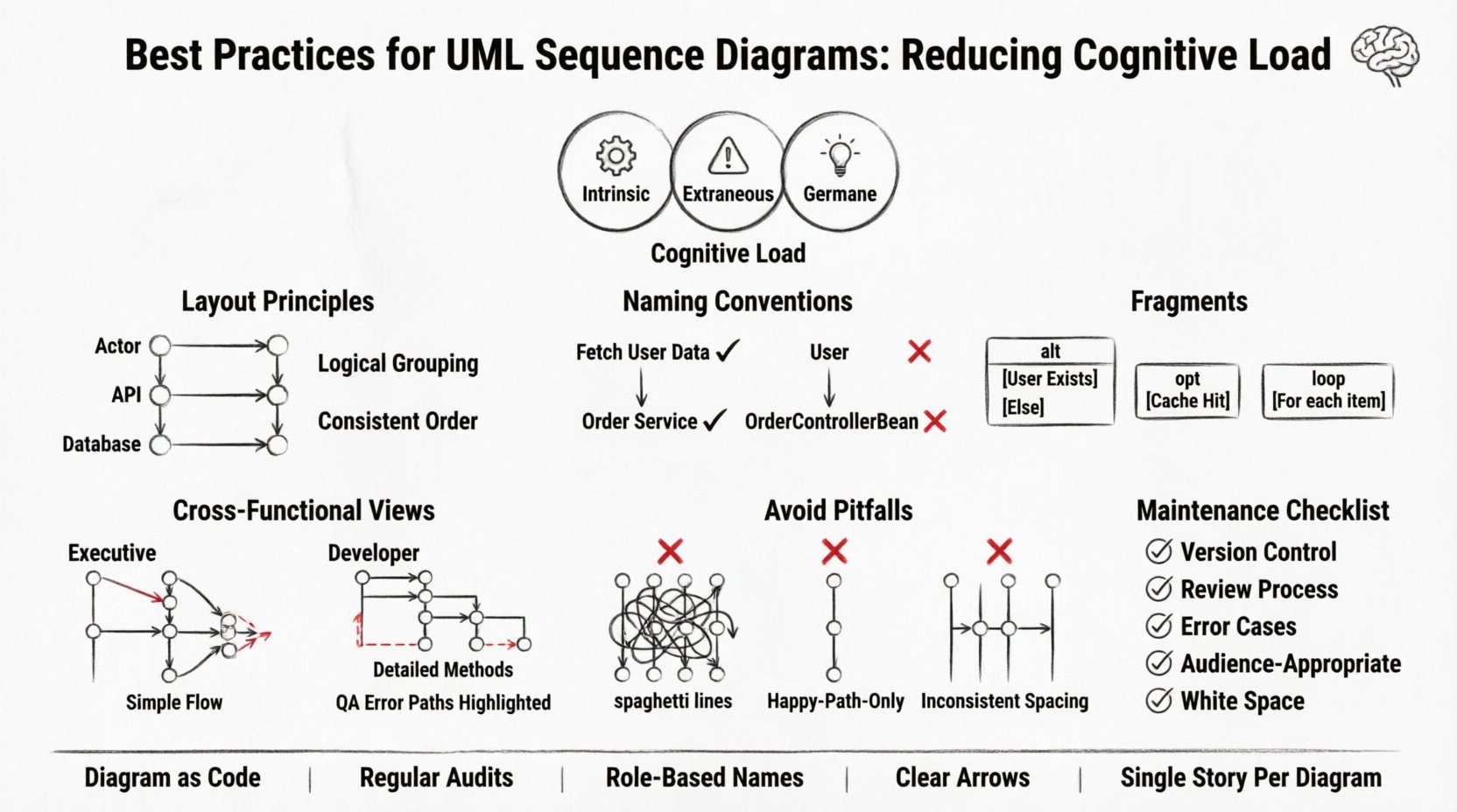
Cognitive load refers to the total amount of mental effort being used in the working memory. In the context of technical documentation, diagrams serve to offload this effort by externalizing complex logic into a visual format. However, a poorly constructed diagram can increase extraneous load rather than reducing it. This happens when the visual design obscures the logical flow, forcing the reader to expend energy deciphering the layout instead of understanding the interaction.
To mitigate this, we must distinguish between three types of load:
- Intrinsic Load: The inherent difficulty of the system logic itself. This cannot be reduced, only managed through proper abstraction.
- Extraneous Load: The mental effort imposed by the way information is presented. This is the primary target for optimization in diagramming.
- Germane Load: The effort required to process, construct, and automate schemas. Good diagrams should encourage this type of engagement by making patterns obvious.
When a team reviews a sequence diagram, they are performing a mental simulation of the system’s behavior. Every redundant label, every crossing line, and every ambiguous arrow adds to the extraneous load. Reducing this load is not merely an aesthetic choice; it is a functional requirement for successful system design.
📐 Structural Integrity and Layout Principles
The spatial arrangement of elements on a sequence diagram dictates the flow of information. Human eyes typically scan from top to bottom and left to right. Aligning your diagram with these natural reading patterns reduces the cognitive effort required to trace a request through the system.
1. Lifeline Placement Strategy
Ordering participants (lifelines) is critical. Place the initiating actor or client on the far left. Arrange subsequent participants based on the frequency of interaction or logical grouping. If the database is accessed by multiple services, group those services together rather than scattering them across the diagram. This clustering helps the reader identify subsystem boundaries quickly.
- Logical Grouping: Group related components. For example, place all backend API handlers adjacent to each other.
- Temporal Proximity: If a service only interacts at the beginning of a process, place it near the start.
- Consistency: Maintain the same order of lifelines across all diagrams within the same subsystem. Changing the order in a subsequent diagram forces the reader to re-map their mental model.
2. Message Arrow Clarity
Arrows represent the flow of control and data. Clarity here is paramount. Avoid zigzagging lines that cross over other messages unnecessarily. Crossing lines create visual noise that makes it difficult to trace specific interactions.
- Direct Paths: Whenever possible, draw messages in a straight horizontal line.
- Vertical Stacking: If messages must be offset vertically, ensure they do not overlap in a way that creates ambiguity about which message belongs to which lifeline.
- Arrowheads: Use solid arrowheads for synchronous calls and open or dashed arrowheads for asynchronous calls. Consistency in symbol usage allows for rapid recognition of message types.
💬 Naming Conventions and Abstraction
Text within a diagram carries significant weight. Labels on messages and lifelines must be precise yet concise. Overly verbose labels force the reader to pause and parse language, while vague labels require them to infer intent. The goal is a signal-to-noise ratio where every word adds value.
1. Message Naming
Use verb-noun phrases for message labels. This immediately conveys action and target. Instead of writing “User Data”, write “Fetch User Data”. This distinction clarifies whether the diagram is describing a data entity or a process operation.
- Specificity: Avoid generic terms like “Process” or “Handle”. Use “Validate Login Token” or “Generate PDF Report”.
- Scope: Do not include the full method signature unless the signature is critical to understanding the interaction. For example, omit parameter types like
(int userId)unless the type dictates the logic flow. - Return Values: Indicate return values clearly. If a method returns data, show the return arrow. If it returns void, omit the return arrow or use a distinct symbol to indicate completion.
2. Lifeline Naming
Lifelines represent objects or systems. Name them based on their role, not their implementation details. A service should be named “Order Service” rather than “OrderControllerBean”. This abstraction allows the diagram to remain relevant even if the underlying implementation changes.
- Role-Based: Focus on what the component does, not how it is built.
- Consistency: Ensure the name matches the documentation and codebase terminology to avoid confusion during code reviews.
- Scope Limitation: If a lifeline represents a single object instance, use a singular noun. If it represents a pool of resources, use a plural noun or a generic role name.
🔄 Managing Complexity with Fragments
Real-world interactions are rarely linear. They involve loops, conditional logic, and optional steps. UML provides fragments (alt, opt, loop, break) to model these scenarios. However, these features can become a source of clutter if overused or misapplied.
1. The Alt and Opt Fragments
Use alt (alternative) for mutually exclusive paths, such as authentication success versus failure. Use opt (optional) for steps that may or may not occur but do not block the main flow.
- Clarity: Place the condition label inside the fragment box. Keep the condition text short, such as “User Exists” or “Cache Hit”.
- Balance: Ensure both branches of an
altfragment are roughly balanced in complexity. If one branch is significantly more complex, consider splitting the diagram to avoid a lopsided visual structure.
2. The Loop Fragment
Loops indicate repeated processing. Do not draw every iteration. Instead, draw one representative iteration and indicate the count with the loop condition, such as “For each item in list”.
- Abstraction: If the loop logic is complex, annotate the diagram with a reference to a separate process description.
- Termination: Clearly define when the loop ends. Does it process until a condition is met, or a fixed number of times?
👥 Cross-Functional Communication Strategies
A sequence diagram is rarely read by a single persona. Developers, product managers, QA engineers, and stakeholders all interact with these models. Each group has different needs and varying levels of technical literacy. The diagram must accommodate this diversity without sacrificing technical accuracy.
1. Layering Information
Consider creating multiple views of the same interaction. A high-level diagram might show the flow between major services, while a detailed diagram focuses on specific API handshakes.
- Executive View: Focus on the start and end points. Hide intermediate processing steps.
- Developer View: Include specific method calls, data structures, and error handling paths.
- QA View: Highlight error states, edge cases, and timeout scenarios.
2. Contextual Annotations
Use notes or comments to explain the “why” behind a decision. If a specific ordering of operations is required for security reasons, annotate it. Do not expect the reader to infer architectural constraints from the arrows alone.
- Security Notes: Indicate where encryption or token validation occurs.
- Performance Notes: Flag operations that are known to be slow or resource-intensive.
- Dependencies: Clarify external dependencies, such as third-party APIs or legacy systems.
🚫 Common Pitfalls to Avoid
Even experienced practitioners can fall into traps that obscure meaning. Recognizing these patterns helps in maintaining high-quality documentation.
1. The “Spaghetti” Diagram
This occurs when too many lifelines are placed on a single canvas, creating a dense web of crossing lines. The solution is modularity. Break complex interactions into smaller, focused diagrams.
- Focus: Each diagram should tell a single story or solve a single problem.
- References: Use “Include” or “Call” fragments to reference sub-processes shown in other diagrams.
2. Ignoring Error Flows
Happy path diagrams are common, but they paint an incomplete picture. Systems fail. Diagrams must show how the system behaves when things go wrong.
- Error Handling: Show where exceptions are caught and how they are propagated.
- Timeouts: Indicate if a request waits indefinitely or fails after a specific duration.
- Recovery: Show retry mechanisms or fallback options.
3. Inconsistent Time Representation
Sequence diagrams imply time flows from top to bottom. However, the vertical distance between messages does not necessarily represent real time. Avoid creating false impressions of latency unless the timing is critical to the design.
- Logical Order: Prioritize the order of operations over the spacing.
- Labels: Use labels like “Async” to clarify that time is not sequential in the strict sense.
📋 Maintenance and Lifecycle Management
A diagram is only as good as its currency. Outdated diagrams are more dangerous than no diagrams at all, as they create false confidence. Integrating diagram maintenance into the development lifecycle is essential.
1. Diagram as Code
Treat diagrams like source code. They should be versioned, reviewed, and merged. This ensures that changes to the system are reflected in the documentation.
- Review Process: Include diagram updates in the pull request checklist.
- Version Control: Store diagram files in the same repository as the codebase.
- Ownership: Assign ownership of specific diagrams to specific team members.
2. Regular Audits
Schedule periodic reviews of the documentation. Identify diagrams that have drifted from the implementation and update them.
- Drift Detection: Compare code logs against diagram flows to identify discrepancies.
- Obsolescence: Archive or delete diagrams that are no longer relevant to the current system version.
📊 Comparison of Effective vs. Ineffective Practices
| Practice | Effective Approach | Ineffective Approach |
|---|---|---|
| Message Naming | Fetch User Profile (Action + Object) | User (Vague noun only) |
| Lifeline Order | Grouped by subsystem (e.g., Auth, Data, UI) | Ordered by height in the codebase |
| Complexity | Split into multiple focused diagrams | One massive diagram with 20+ lifelines |
| Error Handling | Explicit alt fragment for exceptions |
Happy path only |
| Maintenance | Updated with every code commit | Updated once per release cycle |
| Abstraction | Role-based names (e.g., “Payment Gateway”) | Implementation-based names (e.g., “StripeService”) |
🛠️ Practical Checklist for Diagram Review
Before sharing a sequence diagram with a team, run it through this checklist to ensure it reduces cognitive load.
- Readability: Can the main flow be understood without reading every label?
- Consistency: Are lifelines and message types consistent with other diagrams in the project?
- Clarity: Are all abbreviations defined or universally understood?
- Completeness: Does the diagram cover error cases and edge cases?
- Accuracy: Does the diagram match the current implementation?
- Audience: Is the level of detail appropriate for the intended readers?
- Spacing: Is there enough white space to prevent visual crowding?
- Labels: Are all arrows clearly labeled with action verbs?
- Fragments: Are
altandloopfragments necessary and clearly bounded? - Context: Is there a note explaining the scope of the interaction?
🔄 The Evolution of Interaction Models
As systems grow, the need for structured interaction models becomes more critical. The principles of reducing cognitive load apply equally to simple scripts and complex microservices architectures. The shift from monolithic to distributed systems increases the number of participants in a sequence, which naturally increases the potential for confusion.
Addressing this requires discipline. It is tempting to add more detail to make a diagram “complete,” but completeness often leads to clutter. The goal is sufficiency. A diagram should contain exactly enough information to convey the necessary logic without overwhelming the reader.
By adhering to these best practices, teams can transform sequence diagrams from passive documentation artifacts into active communication tools. They become a shared language that bridges the gap between business requirements and technical execution. This alignment reduces friction, accelerates onboarding for new team members, and ensures that the architecture remains understandable as the system evolves.
The effort invested in designing clear, low-load diagrams pays dividends in reduced bugs, faster development, and stronger team cohesion. When the visual representation of the system is intuitive, the team can focus on solving problems rather than deciphering the system’s design.