

Designing complex software systems requires a clear blueprint. Unified Modeling Language (UML) component diagrams serve as a critical tool for visualizing the structural organization of a system. They represent the physical or logical building blocks of software, showing how components interact, depend on one another, and provide functionality. However, creating these diagrams is not merely about drawing boxes and lines. It is an exercise in communication and architectural precision.
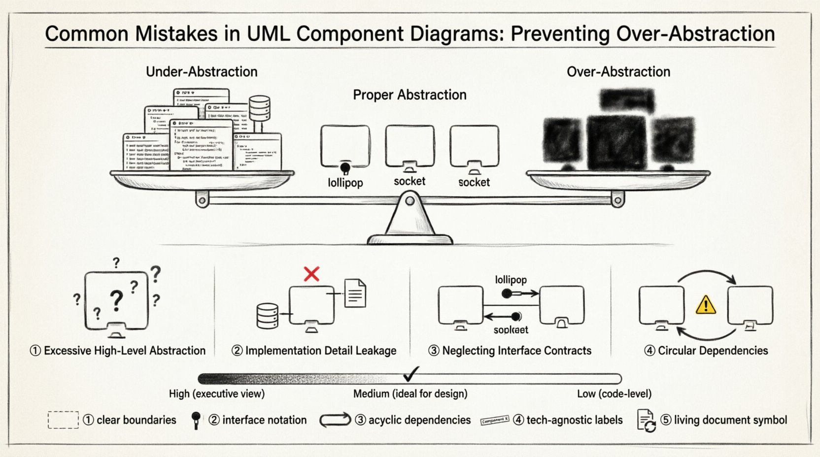
One of the most prevalent challenges faced by architects and developers is over-abstraction. When a diagram becomes too abstract, it loses its utility as a practical guide for implementation. Conversely, when it is too detailed, it becomes cluttered and difficult to maintain. This guide explores the common pitfalls in UML component modeling, focusing on how to balance abstraction to ensure clarity, maintainability, and effective collaboration across teams.
🧠 Understanding Abstraction in System Architecture
Abstraction is the process of hiding complex implementation details and exposing only the necessary functionality. In the context of component diagrams, this means representing a module as a single unit without revealing its internal code structure. The goal is to define what the component does, not how it does it.
However, the line between useful abstraction and over-abstraction is often blurred. Effective abstraction acts as a contract between teams. It allows a backend developer to work on a service without needing to know the specific database queries used by the frontend team. Over-abstraction, on the other hand, creates a “black box” so large that it becomes impossible to reason about its internal behavior or failure points.
- Proper Abstraction: Focuses on interfaces and contracts. It defines boundaries clearly.
- Over-Abstraction: Hides too much logic. It obscures dependencies and makes debugging difficult.
- Under-Abstraction: Exposes internal data structures. It couples components tightly and reduces flexibility.
When designing a system, the diagram should serve as a map for the journey, not the destination. If the map is too simplified, travelers get lost. If it shows every tree and rock, they cannot see the path.
⚠️ Mistake 1: Excessive High-Level Abstraction
The first major error occurs when components are defined at a level that is too broad. This often happens when architects try to create a “big picture” view that satisfies stakeholders but fails to assist developers. In this scenario, a component might represent an entire subsystem, such as “User Management,” without breaking it down into logical parts like “Authentication,” “Profile Management,” and “Notification Service.”
While this simplifies the diagram visually, it creates ambiguity during the implementation phase. Developers are left guessing where specific logic belongs. This lack of granularity can lead to monolithic structures that are difficult to scale or refactor.
Signs of Over-Abstraction
- Components contain hundreds of potential methods or functions.
- Dependencies between components are vague or implied rather than explicit.
- The diagram is useful for executives but confusing for engineers.
- There is no clear indication of data flow between sub-systems.
To correct this, architects should apply the “single responsibility principle” to components. If a box represents too many responsibilities, it should be split. This ensures that each component has a distinct purpose and a manageable scope.
🧱 Mistake 2: Leakage of Implementation Details
On the opposite end of the spectrum is the inclusion of implementation-specific details within the component diagram. This often manifests as showing database schema names, specific programming language libraries, or internal class structures within the component box. For example, labeling a component as “MySQL_User_Table” instead of “User Repository” ties the design to a specific technology.
When diagrams leak implementation details, they lose their value as an architectural tool. Technology stacks change. Databases are swapped. Frameworks are updated. If the diagram is tied to a specific implementation, it becomes obsolete quickly. The design should remain technology-agnostic to ensure longevity and flexibility.
Why This Matters
- Reduced Flexibility: Changing a database requires redesigning the diagram.
- Confusion: Developers focus on the wrong elements (data types vs. behavior).
- Documentation Drift: The diagram diverges from the actual code as soon as the tech stack evolves.
The correct approach is to describe components by their functional role. Use terms like “Data Access Layer” or “Business Logic Service” rather than naming specific tables or classes. This keeps the focus on the architecture rather than the syntax.
🔌 Mistake 3: Neglecting Interface Contracts
A component diagram is fundamentally about interaction. The relationships between components are defined through interfaces. A common mistake is drawing components without clearly defining the provided and required interfaces. Without these contracts, the diagram tells us that Component A connects to Component B, but it does not tell us how they communicate.
Interfaces act as the bridge. They specify the methods, data formats, and protocols that are available. Ignoring this leads to integration errors later in the development lifecycle. Teams may assume they can call functions that do not exist, or they may expect data in a format that is not provided.
Key Interface Elements
- Provided Interface: The functionality a component offers to others. Often shown as a “lollipop” symbol.
- Required Interface: The functionality a component needs from others. Often shown as a “socket” symbol.
- Port: The specific point of connection on the component where the interface is exposed.
By rigorously defining these elements, you create a clear contract. This reduces integration friction and allows teams to work in parallel. If a team knows the interface requirements, they can mock the dependencies and build their component without waiting for the other team to finish.
🔄 Mistake 4: Creating Circular Dependencies
Circular dependencies occur when Component A depends on Component B, and Component B depends on Component A. In a well-designed system, dependencies should flow in a single direction. Circular dependencies create tight coupling, making the system fragile. If one component changes, it forces a change in the other, leading to a ripple effect.
UML component diagrams are an excellent tool for visualizing these cycles. If you see arrows forming a loop, it is a red flag. This structure often indicates that the responsibilities of the two components have been confused or that a shared data structure is being used improperly.
Impact of Circular Dependencies
- Compilation Errors: In many programming languages, circular references prevent code from compiling.
- Testing Difficulties: Isolating a component for unit testing becomes nearly impossible.
- Deployment Complexity: You cannot deploy components independently; they must be deployed together.
To resolve this, architects must identify the shared logic and extract it into a separate, higher-level component. This new component becomes the common ground that both original components depend on, breaking the cycle. This process is often referred to as “dependency inversion.”
⚖️ Balancing Granularity: A Comparative View
Finding the right level of detail is the core challenge of component modeling. The table below outlines the differences between low, medium, and high granularity, along with their respective use cases.
| Granularity Level | Definition | Best Use Case | Risk |
|---|---|---|---|
| High | Large subsystems or entire applications. | Strategic planning, stakeholder presentations. | Lack of actionable detail for developers. |
| Medium | Logical services or functional modules. | System design, API definition, team handoff. | Balanced clarity and detail. |
| Low | Specific classes or database tables. | Database schema design, code generation. | Overly complex, technology-specific. |
Most design phases require a medium level of granularity. This allows the diagram to guide implementation without getting bogged down in syntax. As the project progresses, the diagram can be refined. Starting with high-level abstractions and drilling down into medium-level details is a safer strategy than starting too low.
🔍 Strategies for Validation and Review
Once a diagram is drafted, it must be validated against the architectural goals. A review process is essential to catch the mistakes discussed above before coding begins. Here are several strategies to ensure the diagram is robust.
- The “Code Walkthrough”: Ask developers to read the diagram as if they were writing the code. Can they identify the entry points? Do they know what data to expect?
- Dependency Analysis: Run a tool to check for cycles. Visual inspection is good, but automated checks catch deep loops.
- Interface Auditing: Verify that every connection has a defined interface. No direct coupling without a contract.
- Scope Check: Ensure no component is trying to do too much. If a component box looks crowded, it likely needs splitting.
Regular reviews keep the diagram aligned with the evolving system. Architecture is not a one-time event; it is a continuous process of refinement. The diagram should evolve alongside the code.
🚀 Maintaining Diagram Relevance Over Time
One of the greatest risks to UML component diagrams is obsolescence. As software evolves, the code changes, but the diagram often remains static. This leads to a “documentation debt” where the diagram no longer matches the reality of the system. To prevent this, diagrams should be treated as living documents.
Integrate diagram updates into the development workflow. When a major feature is added or a module is refactored, the diagram should be updated as part of the pull request process. This ensures that the documentation remains accurate and useful.
Additionally, avoid over-mapping. Do not try to model every single interaction. Focus on the critical paths and the core structural components. Peripheral or temporary connections can be omitted to keep the diagram clean. If the diagram becomes too large to view on a single screen, it is likely too detailed.
🛡️ Common Pitfalls in Tool Usage
While the focus here is on design principles, the tools used to create these diagrams can influence the outcome. Some tools encourage box-drawing without enforcing architectural rules. This can lead to diagrams that look professional but lack logical consistency.
Ensure that the modeling tool supports the necessary UML stereotypes and notations for components, interfaces, and ports. Relying on simple shapes like rectangles without specific UML icons can lead to ambiguity. Use standard notation to communicate clearly with other architects who may not be familiar with the specific tool.
📝 Summary of Best Practices
To summarize, creating effective UML component diagrams requires discipline and a focus on clarity over complexity. By avoiding over-abstraction and implementation leakage, you ensure that the diagram remains a valuable asset throughout the software lifecycle.
- Define Clear Boundaries: Ensure each component has a single, well-defined purpose.
- Use Interfaces: Explicitly model provided and required interfaces for all connections.
- Avoid Cycles: Structure dependencies to flow in one direction.
- Stay Technology Agnostic: Do not tie components to specific databases or languages.
- Keep it Updated: Treat the diagram as code that requires maintenance.
By adhering to these principles, you create a design that is not only visually appealing but also functionally sound. The diagram becomes a reliable guide for building robust, scalable, and maintainable software systems.