

In the intricate landscape of system design and business analysis, communication often breaks down. Stakeholders speak the language of processes and goals, while developers speak the language of databases, APIs, and code. This disconnect can lead to misaligned expectations, costly rework, and delayed timelines. The solution lies in a visual modeling technique that transcends these linguistic barriers. The Data Flow Diagram (DFD) serves as this universal translator, mapping the movement of information through a system with clarity and precision. This guide explores how DFDs function not merely as technical artifacts, but as essential tools for alignment.
Understanding the Core Purpose of DFDs 🎯
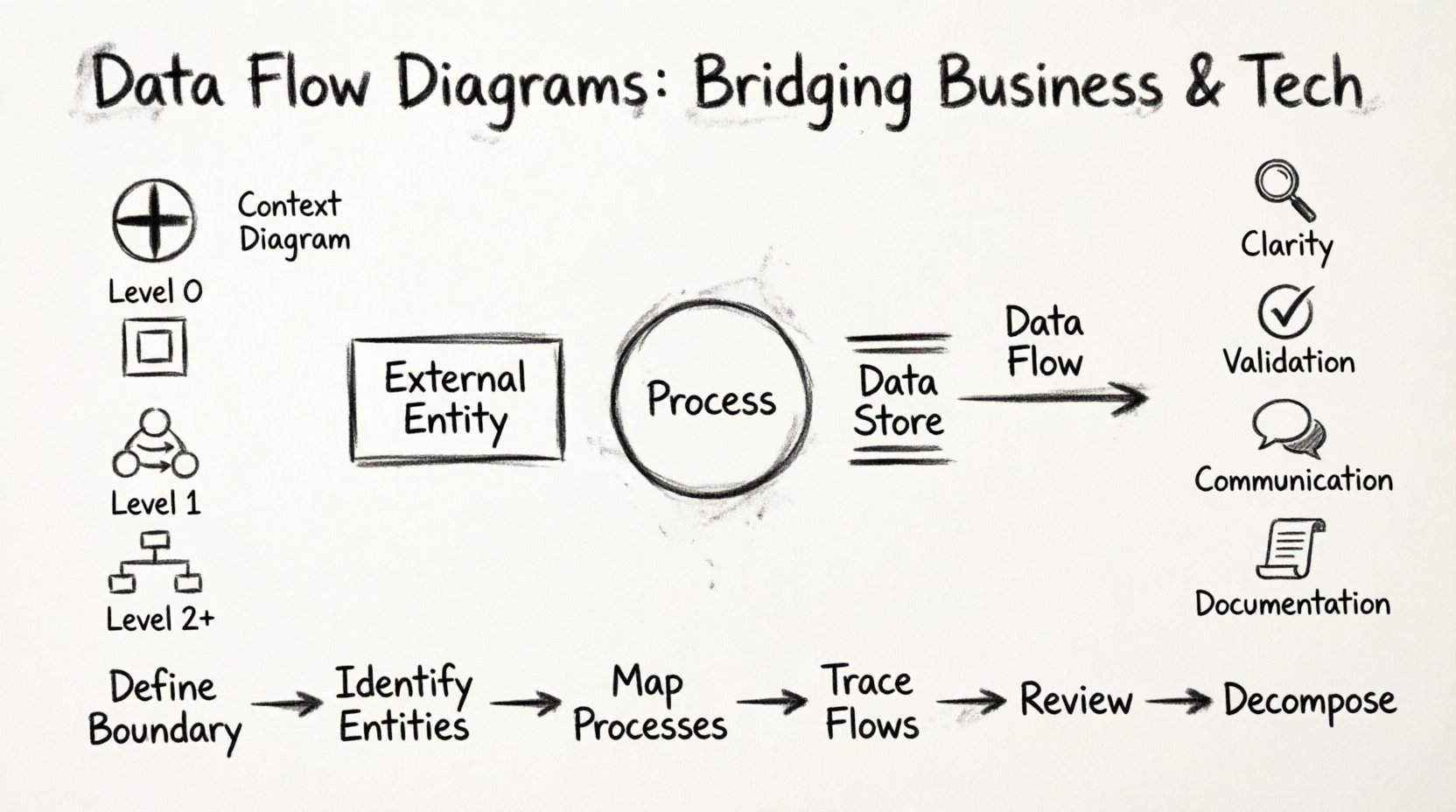
A Data Flow Diagram is a graphical representation of the flow of data through an information system. Unlike flowcharts, which often focus on control logic and decision points, DFDs focus exclusively on where data comes from, where it goes, and how it is stored. This distinction is vital for understanding system architecture without getting bogged down in implementation details.
The primary value of a DFD is its ability to simplify complexity. A business analyst can review a high-level diagram to understand the scope of a project, while a software architect can refine the same diagram to determine database schemas and interface requirements. By stripping away the noise of implementation, the DFD allows all parties to focus on the substance: the data itself.
When implemented correctly, DFDs facilitate:
- Clarity: Visualizing abstract processes into concrete steps.
- Validation: Ensuring all business requirements are accounted for in the design.
- Communication: Providing a common reference point for diverse teams.
- Documentation: Creating a lasting record of system logic.
The Four Fundamental Symbols 🛠️
To construct a meaningful Data Flow Diagram, one must adhere to a standardized set of symbols. These symbols represent the four core components of any data flow system. While variations exist in notation styles, the conceptual meaning remains consistent across methodologies.
| Symbol Name | Visual Representation | Function |
|---|---|---|
| External Entity | Rectangle (or Square) | Represents sources or destinations of data outside the system boundary. Examples include customers, suppliers, or external databases. |
| Process | Circle or Rounded Rectangle | Represents a transformation of data. It takes input data, performs an action, and produces output data. |
| Data Store | Open Rectangle or Two Parallel Lines | Represents a repository where data is held for later use. Examples include files, tables, or archives. |
| Data Flow | Arrow | Represents the movement of data between entities, processes, and stores. It indicates direction and content. |
Each symbol plays a specific role in the ecosystem of the diagram. The External Entity marks the boundary of the system, defining what is inside and what is outside. Processes are the engines that drive change. Data Stores provide the memory necessary for persistence. Data Flows connect these elements, showing the life cycle of information.
Levels of Abstraction in Diagramming 📉
One of the most powerful aspects of Data Flow Diagrams is the ability to break down a complex system into manageable layers. This approach, known as leveling, allows stakeholders to view the system at varying degrees of detail.
| Level | Description | Target Audience |
|---|---|---|
| Context Diagram | The highest level view. Shows the entire system as a single process and its interaction with external entities. | Executives, High-Level Stakeholders |
| Level 0 (Top-Level) | Breaks the system into major processes and data stores. Shows the major data flows. | Project Managers, Lead Architects |
| Level 1 | Further decomposes Level 0 processes into more detailed sub-processes. | System Analysts, Developers |
| Level 2+ | Deep dives into specific complex processes for detailed logic mapping. | Developers, QA Engineers |
The Context Diagram is often the starting point. It answers the question: “What is the system, and who talks to it?” From there, the diagram expands. Level 0 identifies the major functional blocks. Level 1 fills in the gaps, showing how data moves between those blocks. This hierarchical structure prevents the diagram from becoming an unreadable web of lines and arrows.
Constructing a Diagram Step-by-Step 📝
Creating a Data Flow Diagram is a methodical process that requires discipline and attention to detail. It is not a task to be rushed, as errors in the initial mapping can propagate through the entire design phase.
- Define the System Boundary: Identify what is inside the system and what is outside. This determines which entities are external and which data stores are internal.
- Identify External Entities: List all sources and destinations. Who provides data? Who receives the results?
- Map Major Processes: Determine the primary functions the system must perform. These become the initial processes in the Level 0 diagram.
- Trace Data Flows: Connect entities to processes and processes to data stores. Ensure every arrow has a clear purpose and label.
- Review for Completeness: Check that every process has at least one input and one output. A process that has no input or output is often an error.
- Decompose as Needed: If a process is too complex, break it down into sub-processes for the next level of the diagram.
During this process, it is crucial to label every data flow accurately. A label like “Data” is insufficient. It should be specific, such as “Order Details” or “Customer Profile.” This specificity ensures that the diagram remains useful for developers and analysts alike.
Aligning Business Needs with Technical Constraints 🧠
The true power of the DFD lies in its ability to bridge the gap between business requirements and technical implementation. Business stakeholders focus on outcomes: “We need to process orders quickly.” Technical teams focus on infrastructure: “We need a database schema that supports high concurrency.” The DFD connects these two worlds.
When a business analyst draws a DFD, they are describing the logical flow of information. They do not need to know which database engine will store the data. When a developer reads the DFD, they translate that logical flow into physical structures. They see a Data Store and know to create a table. They see a Process and know to write a function or a service.
This separation of concerns is critical. It allows the business to validate the logic without worrying about the technology. It allows the technology to plan the implementation without worrying about the business rules. The DFD acts as the contract between these two disciplines.
Consider the scenario of a payment processing system. The business side cares about the sequence: Request Payment -> Verify Funds -> Charge Card -> Send Receipt. The technical side cares about security, transaction logs, and API endpoints. A well-drawn DFD captures the sequence clearly, allowing the technical team to implement the security measures around the correct steps without altering the flow itself.
Common Pitfalls and How to Avoid Them ⚠️
Even experienced practitioners can fall into traps when creating Data Flow Diagrams. Recognizing these common errors early can save significant time and effort.
- Control Flow vs. Data Flow: Avoid including decision logic or loops within the data flow itself. DFDs show what data moves, not how the system decides to move it. Use decision diamonds only if absolutely necessary, but prefer separate logic diagrams for complex branching.
- Data Spaghetti: Ensure arrows do not cross unnecessarily. A diagram that looks like a tangled knot is hard to read. Use orthogonal lines and clear routing to maintain readability.
- Ghost Processes: Do not create processes that do not transform data. If a process simply passes data from one place to another without change, it is often redundant.
- Unbalanced Decomposition: When breaking a process down into sub-processes, ensure the inputs and outputs match the parent process. If the Level 1 process has an input that the Level 0 process did not have, the diagram is unbalanced.
- Missing Data Stores: Do not forget where data is saved. If a process generates information that is used later, there must be a Data Store to hold it.
Another frequent issue is the lack of naming consistency. Use the same terminology throughout the diagram. If a field is called “Customer ID” in one place, do not call it “Client Number” in another. Consistency reduces cognitive load for anyone reviewing the document.
Keeping Your Diagrams Alive and Accurate 🔄
Once a system is built, the DFD does not disappear. It becomes a living document that requires maintenance. Systems evolve, features are added, and processes change. If the diagram does not reflect these changes, it becomes misleading documentation that can cause more harm than good.
Versioning is essential for DFD maintenance. When a significant change occurs, update the diagram and note the version number. This allows teams to track the evolution of the system over time. It also provides a reference point for understanding why certain design decisions were made in the past.
Regular reviews should be scheduled. Periodically, have a cross-functional team review the diagrams. Ask the business stakeholders if the flows still match their current understanding. Ask the developers if the implementation matches the diagram. This alignment ensures the documentation remains a reliable source of truth.
The Value of Visual Clarity in System Design 🧩
In an era of complex software architectures, the ability to visualize data movement is more important than ever. Microservices, cloud computing, and distributed systems make it difficult to track where information goes. A Data Flow Diagram provides a simplified map of this complexity.
Visual clarity reduces risk. When a system fails, a DFD helps trace the point of failure. When a new feature is requested, a DFD helps assess the impact. When a new team member joins, a DFD helps them understand the system faster than reading code alone.
The goal is not to create the most beautiful diagram, but the most effective one. Simplicity is key. Avoid clutter. Focus on the flow. Ensure that anyone who looks at the diagram can understand the movement of data without needing a legend or a guide.
Final Thoughts on DFD Implementation 📈
Data Flow Diagrams are a foundational tool for system design. They provide a structured way to think about information movement, separating the “what” from the “how.” By adhering to standard symbols, maintaining levels of abstraction, and keeping the diagrams updated, organizations can ensure that their technical teams and business stakeholders remain aligned.
The effort invested in creating accurate DFDs pays dividends in reduced rework, clearer requirements, and smoother development cycles. They are not just drawings; they are the blueprints for understanding complex systems. In a world where communication is often the biggest bottleneck, the DFD offers a clear path forward.