

In the complex landscape of system architecture, few tools have been as foundational yet as misunderstood as the Data Flow Diagram (DFD). Often conflated with flowcharts or dismissed as obsolete artifacts of older engineering methodologies, the DFD remains a critical instrument for visualizing information movement within a system. However, a cloud of misconceptions surrounds its application, leading to poor documentation and architectural confusion.
This guide delves deep into the realities of Data Flow Diagrams. We will dismantle common myths, clarify the distinction between data and control, and outline how to leverage DFDs for modern system design without getting bogged down in unnecessary bureaucracy. Whether you are a business analyst, a software architect, or a developer, understanding the mechanics of data flow is essential for building robust, maintainable systems.
Understanding the Core: What is a Data Flow Diagram? 📊
A Data Flow Diagram is a graphical representation of the flow of data through an information system. Unlike a flowchart, which depicts the logic and control flow of a program, a DFD focuses exclusively on data. It shows where data originates, where it travels, where it is stored, and where it ultimately exits the system.
The primary purpose of a DFD is to provide a clear, high-level view of the system’s boundaries and processes. It allows stakeholders to understand the system without needing to know the underlying code or implementation details. By abstracting away the technical specifics, DFDs facilitate communication between technical teams and business owners.
Key Components of a DFD 🧩
To create an accurate diagram, one must understand the four fundamental symbols used in structured system design. These elements form the vocabulary of the diagram.
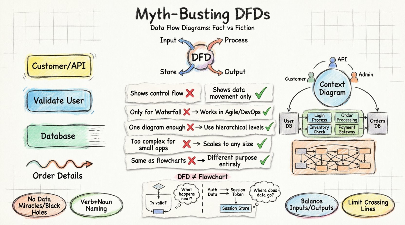
- External Entity: Also known as a source or sink, this represents a person, organization, or external system that interacts with the current system. It is the origin or destination of data but lies outside the system’s boundary. Example: A customer, a payment gateway, or a government database.
- Process: This represents a transformation or action performed on the data. It takes input data, manipulates it, and produces output data. Processes are usually numbered to indicate their level of detail. Example: Calculate Tax, Validate User, Generate Report.
- Data Store: This indicates a place where data is stored for future use. It represents a database, a file, or a physical archive. Data stores do not initiate data flow; they only receive or provide data when requested by a process. Example: Customer Database, Transaction Logs, Inventory File.
- Data Flow: These are the arrows that connect the components. They represent the movement of data. Crucially, data flows must be labeled with the name of the data being transferred. Example: Order Details, Payment Confirmation, Search Query.
Debunking Common Myths About DFDs 🚫
There is significant confusion regarding the utility and structure of Data Flow Diagrams. Many teams avoid them due to perceived complexity or irrelevance. Below, we separate fact from fiction regarding DFD usage.
| Myth ❌ | Fact ✅ |
|---|---|
| DFDs show control flow and logic. | DFDs show data movement only. They do not indicate the order of execution, loops, or decision points. |
| DFDs are only for waterfall projects. | DFDs work in Agile and DevOps. They serve as living documentation for microservices and API mapping. |
| A single diagram is enough. | DFDs require a hierarchy. You need Context, Level 0, Level 1, and Level 2 diagrams to show depth. |
| DFDs are too complex for small apps. | DFDs scale to any size. Even a simple blog needs to map data flow to avoid logic errors. |
| DFDs are the same as Flowcharts. | They are fundamentally different. Flowcharts show how it works; DFDs show what data moves. |
Myth 1: DFDs Show Control Flow
One of the most persistent errors is treating a DFD like a flowchart. In a flowchart, arrows represent the sequence of operations. If a condition is met, the path changes. In a DFD, arrows represent the transport of information. The sequence of processes is not defined by the arrows. A process does not necessarily happen immediately after the data arrives. This distinction is vital for understanding data dependencies versus execution logic.
Myth 2: DFDs Are Only for Waterfall
Because DFDs were popularized during the structured analysis era of the 1970s, many assume they belong to rigid, document-heavy Waterfall methodologies. This is incorrect. In modern Agile environments, DFDs are excellent for mapping API endpoints and microservice interactions. They help teams visualize data ownership and boundaries, which is critical when services are decoupled.
Myth 3: One Diagram Suffices
Attempting to capture an entire system in one diagram leads to clutter and confusion. The standard practice is to use a top-down decomposition approach. You start with a Context Diagram, then break down the main process into Level 0, Level 1, and so on. This allows different stakeholders to view the system at the appropriate level of detail.
The Hierarchy of DFD Levels 📈
To maintain clarity, DFDs are organized into a hierarchy of abstraction. Each level provides a different perspective on the system.
1. Context Diagram (Level 0) 🌍
The Context Diagram is the highest level of abstraction. It represents the entire system as a single process. It shows the system’s relationship with external entities. There are no internal data stores or sub-processes visible.
- Focus: System boundaries.
- Use Case: Onboarding new team members or defining project scope.
- Visuals: One circle (the system) and surrounding rectangles (entities).
2. Level 0 Diagram (DFD Level 0) 🎯
Also known as the Top-Level DFD, this diagram explodes the single process from the Context Diagram into major sub-processes. It introduces data stores and shows how data flows between the major components.
- Focus: Major system functions.
- Use Case: Architectural planning and identifying major data stores.
- Visuals: 3 to 7 major processes, connected by data flows and stores.
3. Level 1 and Level 2 Diagrams 🔍
These diagrams provide further decomposition. Level 1 breaks down the processes from Level 0. Level 2 breaks down the processes from Level 1. This continues until the processes are atomic enough to be implemented as code or specific logic steps.
- Focus: Detailed logic and specific data transformations.
- Use Case: Developer specifications and unit testing requirements.
- Visuals: Complex networks of processes and data flows.
DFD vs. Flowchart: A Critical Distinction 🔄
Confusion between Data Flow Diagrams and Flowcharts often leads to documentation that satisfies neither purpose. Understanding the difference is essential for effective system design.
Control vs. Data
A Flowchart is concerned with control flow. It answers the question: “What happens next?” It includes decision diamonds (Yes/No), loops, and specific execution paths. It is ideal for describing algorithms.
A Data Flow Diagram is concerned with data flow. It answers the question: “Where does the information go?” It ignores the order of operations. It does not show loops or decision logic. It is ideal for describing system requirements and architecture.
When to Use Which?
- Use a Flowchart: When designing a specific algorithm, debugging logic errors, or explaining the steps of a user interaction within a single module.
- Use a DFD: When defining system boundaries, mapping data integration between services, or documenting the overall architecture for stakeholders.
Best Practices for Designing DFDs 🛠️
Creating a useful DFD requires adherence to specific rules. Violating these rules creates “anomalies” that confuse readers and invalidate the model.
1. Avoid Data Miracles and Black Holes
A Data Miracle occurs when a process produces data without any input. This implies the data appears out of nowhere, which is logically impossible. Every output must stem from an input.
A Black Hole occurs when a process consumes data but produces no output. This implies the data disappears into a void. Every input must result in some transformation or storage.
2. Naming Conventions
Clear naming is non-negotiable. Processes should be named using a verb and a noun (e.g., Update Customer Profile, not just Update). Data flows should be named with the data they carry (e.g., Invoice, not just Send). Data stores should be plural nouns (e.g., Orders, not Order).
3. Balancing
When decomposing a process from a higher-level diagram to a lower-level diagram, the inputs and outputs must remain consistent. If a Level 0 process has an input of Order Request, the Level 1 processes that make up that parent process must collectively accept an Order Request and produce the same outputs. This ensures data integrity across levels.
4. Limit Data Flows
Too many crossing lines create a “spaghetti diagram.” If a process is connected to too many entities, it may be too broad. Consider splitting the process into smaller, more focused functions to improve readability.
DFDs in Modern System Architecture 🏗️
While DFDs originated decades ago, they remain highly relevant in modern contexts, particularly with the rise of microservices and API-driven architectures.
Mapping Microservices
In a monolithic application, data flow is often internal. In a microservices architecture, data crosses network boundaries. A DFD is an excellent tool for visualizing these boundaries. It helps identify which service owns which data store and how services communicate via APIs.
API Documentation
RESTful APIs define endpoints, methods, and data payloads. A DFD can visualize the lifecycle of a request. For example, a DFD can show how a Client Request flows through an API Gateway, reaches a Service A, retrieves data from a Database, and returns a Response.
Security and Compliance
When dealing with sensitive data (PII, financial records), DFDs help identify where data is stored and transmitted. This is crucial for compliance with regulations like GDPR or HIPAA. By mapping data flows, architects can identify where encryption is needed and where access controls must be applied.
Common Pitfalls to Avoid ⚠️
Even experienced architects make mistakes when creating DFDs. Being aware of common pitfalls can save significant time during reviews.
- Ignoring Data Validation: DFDs often assume data is valid. In reality, data often enters the system in an invalid state. While DFDs don’t show validation logic explicitly, the flow should account for error messages or rejection data.
- Over-Detailed Levels: Do not break a process down into atomic code statements. A DFD is for system design, not code implementation. If a process is too granular, the diagram becomes unreadable.
- Inconsistent Symbolism: Stick to one notation standard (e.g., Gane & Sarson or Yourdon & Coad). Mixing symbols can confuse readers who are familiar with only one style.
- Static Documentation: A DFD that is created once and never updated becomes a liability. As the system evolves, the diagram must be revised to reflect the current state of the architecture.
Step-by-Step Creation Guide 📝
Follow this structured approach to develop a complete DFD set for your project.
- Identify External Entities: List all users, systems, and devices that interact with the system. Draw them as rectangles.
- Draw the Context Diagram: Place the system as a single circle in the center. Draw arrows between entities and the system. Label the arrows with the data exchanged.
- Decompose the System: Expand the central circle into Level 0. Identify major functions (Processes) and where data is saved (Data Stores).
- Refine Data Flows: Ensure every arrow has a name. Check for balanced inputs and outputs between levels.
- Validate with Stakeholders: Review the diagram with business owners. Ensure the data flow matches their mental model of the system.
- Iterate: As requirements change, update the diagram. Keep the documentation synchronized with the code.
Final Considerations 🤔
Data Flow Diagrams are more than just drawing exercises. They are a language for describing how information behaves within a system. By understanding the distinction between data and control, adhering to the rules of decomposition, and avoiding common myths, teams can leverage DFDs to build clearer, more robust architectures.
The goal is not to create a perfect diagram that never changes, but to create a living representation that aids communication. Whether you are designing a simple web form or a distributed cloud infrastructure, the principles of data flow remain constant. Clarity in data movement leads to clarity in system behavior. Invest the time to map your flows accurately, and the downstream benefits in development and maintenance will be evident.
Remember, the best diagram is the one that is understood by the team. Use the hierarchy, respect the components, and keep the focus on the data. With these practices, DFDs remain a powerful tool in the system designer’s arsenal.