

In the complex landscape of software development and system analysis, clarity is often the missing link between a successful project and a failed one. When teams struggle to understand how information moves through an application, misunderstandings arise, leading to rework, bugs, and delayed delivery. This is where the Data Flow Diagram, commonly known as the DFD, steps in. It serves as a visual language that bridges the gap between technical specifications and business requirements. By mapping out the flow of data, stakeholders can see the system’s logic without needing to decipher dense code or abstract text. 🧩
The process of creating a DFD forces analysts to think critically about every input, output, and storage point within a system. It transforms abstract concepts into concrete visual representations. This guide explores how these diagrams function, their core components, and the specific ways they enhance communication among developers, business analysts, and end users. Whether you are designing a new inventory management system or auditing an existing database structure, understanding the mechanics of data visualization is essential for modern system architecture. 🛠️
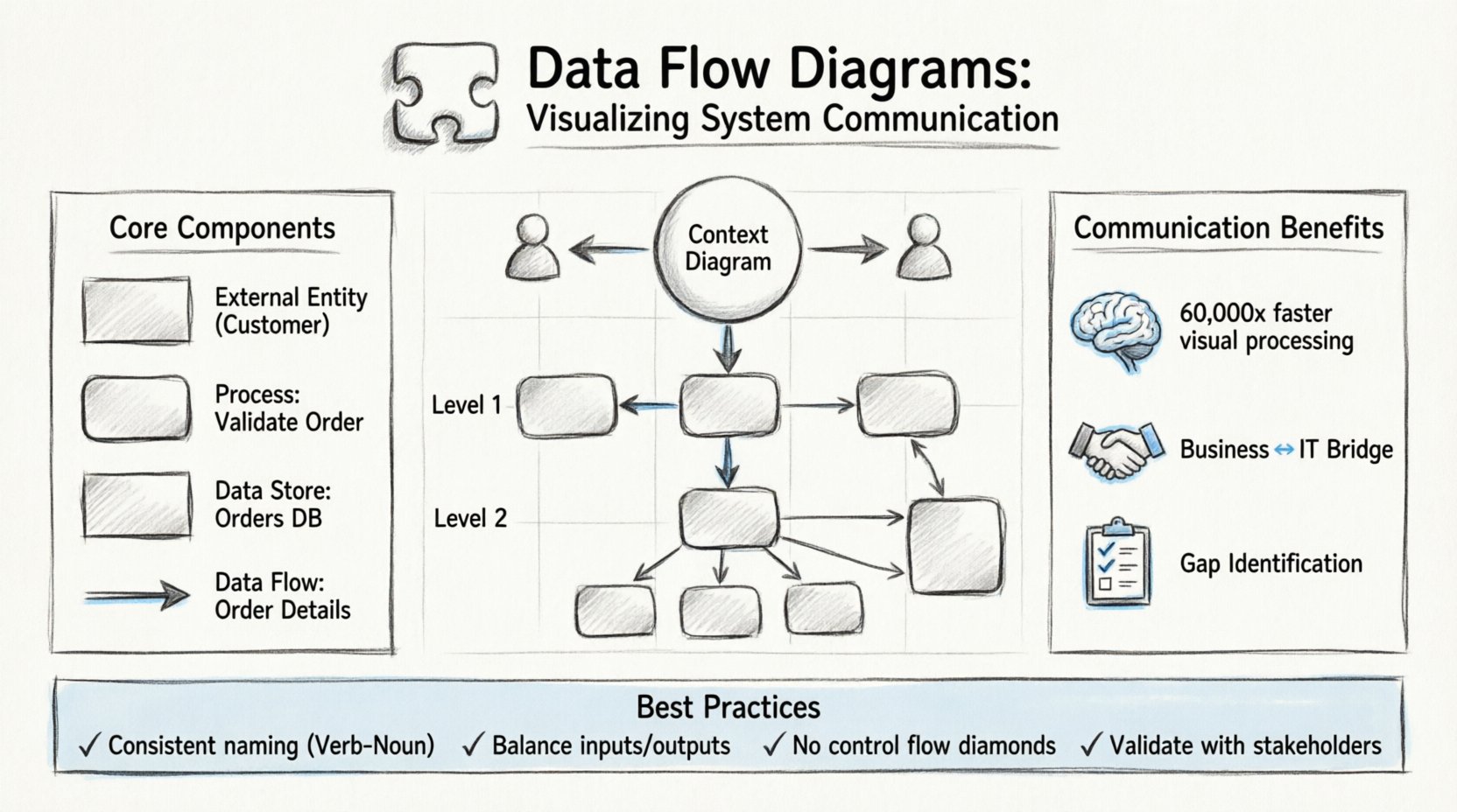
What is a Data Flow Diagram? 🤔
A Data Flow Diagram is a graphical representation of the flow of data through an information system. Unlike a flowchart, which depicts the control flow and decision logic of a process, a DFD focuses exclusively on the data itself. It shows how data enters the system, how it is transformed, where it is stored, and how it exits. This distinction is vital because it allows teams to separate the “what” from the “how”. The “what” is the data movement; the “how” is the logic that processes that data.
DFDs were popularized by Yourdon and DeMarco in the late 1970s as part of Structured Systems Analysis and Design Methodology (SSADM). Since then, they have remained a staple in systems analysis because they are intuitive. A business stakeholder can look at a diagram and understand the high-level process without knowing a single line of code. Conversely, a developer can look at the same diagram to understand the data requirements for a specific function. This shared understanding reduces the friction often found in the handoff between business and technology teams.
Why Visualization Matters in System Analysis
Human brains are wired to process visual information faster than text. Studies suggest that the brain can process images 60,000 times faster than text. In a system design meeting, reading a five-page requirements document can lead to fatigue and missed details. Presenting the same information as a diagram allows participants to spot anomalies, missing links, or redundant processes almost instantly. 🧠
- Immediate Comprehension: Stakeholders can grasp the scope of a project within minutes.
- Gap Identification: Missing data stores or undefined flows become obvious visually.
- Consistency: A single diagram ensures everyone is looking at the same version of the truth.
- Documentation: Diagrams serve as living documentation that evolves with the system.
Core Components of a DFD 🧱
To create an accurate diagram, one must understand the four fundamental symbols used to construct it. These symbols are standardized to ensure that any analyst or developer can read the diagram regardless of their specific role. Each component represents a specific aspect of the system’s data handling.
1. External Entities (Sources and Destinations) 🚪
External entities represent people, organizations, or other systems that interact with the system being modeled. They are the source of data entering the system or the destination where data leaves the system. In a DFD, these are typically drawn as rectangles. It is crucial to distinguish between internal processes and external entities. If a component is outside the boundary of the system being analyzed, it is an external entity.
- Examples: A Customer, a Bank, a Weather Service API, or a Human Administrator.
- Role: They initiate requests or receive final reports.
2. Processes (Transformations) ⚙️
Processes are where the data actually changes. They take input data, transform it, and produce output data. In a DFD, processes are usually drawn as rounded rectangles or circles. Unlike a function in code, a process in a DFD does not necessarily imply a specific program or script; it represents a logical operation. For example, “Calculate Tax” is a process, regardless of whether it is done by a spreadsheet, a script, or a human accountant.
- Naming: Processes should be named with a verb followed by a noun (e.g., “Validate Login”).
- Transformation: The data entering the process must be different from the data leaving it.
3. Data Stores (Repositories) 📁
Data stores represent places where data is held at rest. This could be a database table, a file on a disk, or even a physical filing cabinet. In the diagram, these are typically drawn as open-ended rectangles or parallel lines. It is important to note that data flows into and out of stores, but processes do not interact directly with other processes without a store in between in some notations, though modern interpretations allow direct flows if the context is clear.
- Persistence: Data must be saved here to be retrieved later.
- Access: Processes read from or write to data stores.
4. Data Flows (Movements) 🔄
Data flows indicate the movement of data between entities, processes, and stores. They are represented by arrows. Every arrow must have a label describing the data being moved. An arrow without a label is considered invalid in a formal DFD. The direction of the arrow shows the path of the data. A single data flow cannot loop back to the same process without going through a store or another process.
- Labels: Must be singular nouns (e.g., “Order Details”, not “Ordering Details”).
- Direction: Clearly indicates the source and destination.
| Component | Shape | Function | Example |
|---|---|---|---|
| External Entity | Rectangle | Source or Destination | Customer, Supplier |
| Process | Rounded Rectangle | Data Transformation | Process Order, Verify ID |
| Data Store | Open Rectangle | Data Storage | Customer DB, Inventory Log |
| Data Flow | Arrow | Data Movement | Payment Info, Shipping Request |
Levels of Decomposition 📉
One of the most powerful features of a DFD is the ability to decompose a system into different levels of detail. This is known as hierarchical modeling. It allows a team to view the system from a high-level overview down to the specific mechanics of individual transactions. This prevents information overload and allows different stakeholders to focus on the level of detail relevant to them.
Context Diagram (Level 0) 🌍
The Context Diagram is the highest level of abstraction. It shows the system as a single process bubble and all the external entities that interact with it. It does not show internal data stores or detailed processes. The purpose is to define the boundary of the system. It answers the question: “What is the scope of this system?”
- Focus: Interaction with the outside world.
- Detail: Minimal. Only major inputs and outputs.
- Audience: Executives, Project Managers, Clients.
Level 1 Diagram 📊
The Level 1 Diagram explodes the single process from the Context Diagram into major sub-processes. It introduces data stores and shows how the major functions interact. This is often the first detailed diagram created during the analysis phase. It breaks down the “System” into “Module A”, “Module B”, and “Module C”. This level is crucial for understanding the major architecture of the system.
- Focus: Major functional areas.
- Detail: Intermediate. Shows main data stores.
- Audience: System Architects, Lead Developers.
Level 2 and Beyond (Detailed) 🔍
Level 2 diagrams take specific processes from Level 1 and break them down further. This continues until the processes are simple enough to be implemented directly as code or manual procedures. This level is used for technical specification. If a process is too complex to be implemented, it must be decomposed further. However, over-decomposition can lead to confusion, so analysts must know when to stop.
- Focus: Specific logic and data transformations.
- Detail: High. Shows all inputs and outputs for a specific function.
- Audience: Developers, Quality Assurance Engineers.
| Level | Detail | Primary Goal |
|---|---|---|
| Context (Level 0) | Low | Define System Boundaries |
| Level 1 | Medium | Define Major Sub-Processes |
| Level 2+ | High | Define Specific Logic & Logic |
Enhancing Communication Between Teams 🤝
The true power of a DFD lies in its ability to facilitate communication. In many organizations, silos exist between the business team and the technical team. The business team speaks in terms of workflows and goals, while the technical team speaks in terms of APIs and databases. A DFD acts as a translator between these two languages.
Bridging the Gap Between Business and IT
When a business analyst creates a DFD based on user interviews, it captures the “happy path” and the exceptions. When a developer reviews this diagram, they can identify where the data needs to be validated or where error handling is required. Because the diagram is visual, the developer can point to a specific arrow and ask, “What happens if this data is missing?” This leads to more robust error handling in the final product.
- Shared Vocabulary: Both sides agree on what “Data Flow” means.
- Visual Reference: Reduces ambiguity in verbal descriptions.
- Early Detection: Logic errors can be found before coding begins.
Supporting Stakeholder Alignment
Stakeholders often have different priorities. The finance team cares about transaction accuracy, while the operations team cares about speed. A DFD shows the flow of data across these departments. If a specific data store is critical for both, it becomes a shared responsibility. This visibility helps in assigning ownership and accountability for data integrity. It ensures that everyone understands how their specific role fits into the larger system.
Best Practices for Clear Modeling 📝
Creating a DFD is not just about drawing shapes; it is about following a set of rules that ensure the diagram remains accurate and useful. Deviating from these rules can lead to diagrams that are confusing or technically impossible to implement.
1. Maintain Consistency in Naming
Data flows should always be labeled with the same name throughout the diagram. If an arrow is labeled “User Data” at the top of the diagram, it should not be labeled “Login Info” in the middle. Consistency prevents confusion about whether data is being split or transformed. Process names should also follow a Verb-Noun structure to indicate action.
2. Balance the Diagrams
When moving from one level to the next, the inputs and outputs must remain consistent. If a Level 0 process has an input of “Order”, the Level 1 diagram must show that “Order” entering the system. If the Level 1 diagram introduces a new input that was not in the Level 0 diagram, the model is unbalanced. This balancing act ensures that the decomposition does not introduce new functionality that was not scoped in the original requirements.
3. Avoid Control Flow
A common mistake is to mix control logic (if/else statements) into a DFD. DFDs are for data, not control. Do not draw decision diamonds. If a process requires a decision, it should be documented in a separate logic flow or within the process description. Mixing control flow confuses the reader about whether the arrow represents data or a command.
4. Limit Fan-Out and Fan-In
While not a strict rule, it is best practice to avoid having too many arrows entering or leaving a single process. If a process has 20 inputs, it is likely doing too much and should be decomposed. High fan-in and fan-out make the diagram difficult to read and the process difficult to maintain.
5. Validate with Stakeholders
A DFD is a communication tool, not a finished artifact. It must be reviewed with the people who will use or build the system. A diagram that looks perfect on paper might miss a real-world constraint that a user would point out during a review session. Regular validation ensures the model reflects reality.
Common Mistakes to Avoid ⚠️
Even experienced analysts make errors when modeling data. Recognizing these pitfalls early can save significant time during the development phase. Below are the most frequent issues encountered in DFD creation.
- Black Holes: A process that has inputs but no outputs. Data disappears, which is impossible in a real system.
- Gray Holes: A process that has inputs and outputs, but the output does not logically result from the input. The transformation is undefined.
- Data Stores without Flows: A storage box that data never enters or leaves. This indicates unnecessary storage or a missing link in the logic.
- Direct Entity to Entity Flows: Data should not flow directly from one external entity to another without passing through the system. If it does, the system is not actually processing that data.
- Over-Engineering: Trying to model every single button click in a DFD. DFDs are for system-level data flow, not user interface navigation.
Integrating DFDs into the Development Lifecycle 🔗
Data Flow Diagrams are not isolated artifacts; they fit into the broader Software Development Life Cycle (SDLC). They are typically created during the requirements gathering and analysis phase. However, their utility extends beyond this initial stage.
Design Phase Integration
During the design phase, the DFD serves as a blueprint for database schema design. Every data store in the DFD translates into a table or collection in the database. Every data flow translates into an API endpoint or a service call. This direct mapping ensures that the database design supports the business logic outlined in the analysis phase.
Maintenance and Refactoring
When a system requires updates, the DFD is the first document to review. If a new feature is requested, analysts can trace the data flow to see where the new data should enter and where it should exit. This prevents the “spaghetti code” phenomenon where new logic is tacked onto old logic without understanding the existing data dependencies. It acts as a map for future developers.
Gap Analysis
During system audits, DFDs can be compared against the actual system behavior. If the diagram shows a data flow that does not exist in the code, it indicates a gap in requirements or implementation. Conversely, if the system has data flows not shown in the diagram, it indicates undocumented features or shadow IT. This comparison is vital for compliance and security reviews.
The Future of Data Visualization in Systems 🚀
While DFDs have been around for decades, their principles remain relevant as systems become more complex. Modern cloud architectures, microservices, and event-driven systems still rely on the fundamental concept of data movement. The tools used to create DFDs have evolved from paper and pen to sophisticated modeling software, but the core rules of data visualization remain unchanged.
As organizations move toward data-driven decision-making, the ability to visualize data flow becomes even more critical. Understanding where data comes from, where it goes, and how it is transformed is the foundation of data governance. A DFD provides the high-level view needed to implement data policies effectively.
By adopting these diagrams, teams can foster a culture of clarity. When everyone understands the flow of information, collaboration becomes smoother, and the path from idea to implementation becomes more direct. It is a tool that respects the complexity of the system while simplifying the communication of that complexity. 🌟
Investing time in creating accurate and detailed Data Flow Diagrams pays dividends throughout the lifecycle of a project. It reduces the cost of changes, minimizes miscommunication, and ensures that the final system aligns with the intended business goals. In a world where data is the most valuable asset, visualizing its journey is not just an option; it is a necessity.